Scatter Plot | The Complete SAT Course - Class 10 PDF Download
Scatter Plots are described as one of the most useful inventions in statistical graphs. Originally, the scatter plot was presented by an English Scientist, John Frederick W. Herschel, in the year 1833. Herschel used it in the study of the orbit of the double stars. He plotted the positional angle of the double star in relation to the year of measurement. The scatter plot was used to understand the fundamental relationship between the two measurements. Even though bar charts and line plots are frequently used, the scatter plot still dominates the scientific and business world. It is very easy for people to look at points on a scale and understand their relationship.
What is a Scatter Plot?
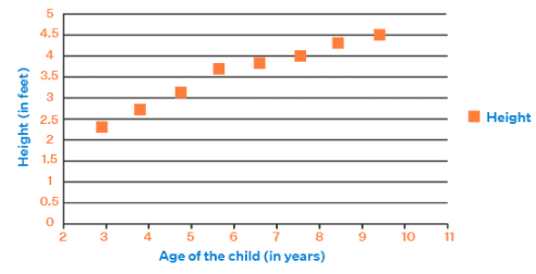
A scatter plot is a means to represent data in a graphical format. A simple scatter plot makes use of the Coordinate axes to plot the points, based on their values. The following scatter plot excel data for age (of the child in years) and height (of the child in feet) can be represented as a scatter plot.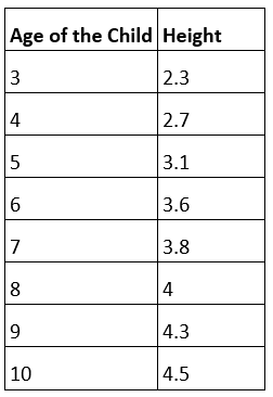
Scatter Plot Application
Here let us look at real-life application represented by scatter plot.
Example: Days of the week and the sales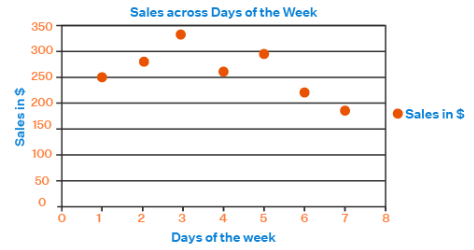
How to Construct a Scatter Plot?
There are three simple steps to plot a scatter plot.
- STEP I: Identify the x-axis and y-axis for the scatter plot.
- STEP II: Define the scale for each of the axes.
- STEP III: Plot the points based on their values.
Types of Scatter Plot
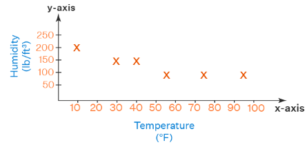
A scatter plot helps find the relationship between two variables. This relationship is referred to as a correlation. Based on the correlation, scatter plots can be classified as follows.
- Scatter Plot for Positive Correlation
- Scatter Plot for Negative Correlation
- Scatter Plot for Null Correlation
Scatter Plot for Positive Correlation
A scatter plot with increasing values of both variables can be said to have a positive correlation. The scatter plot for the relationship between the time spent studying for an examination and the marks scored can be referred to as having a positive correlation.
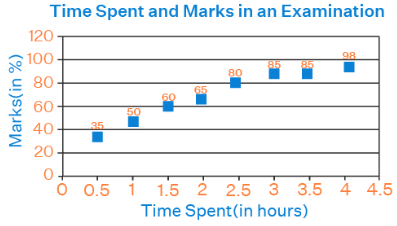
Scatter Plot for Negative Correlation
A scatter plot with an increasing value of one variable and a decreasing value for another variable can be said to have a negative correlation. Observe the below image of negative scatter plot depicting the amount of production of wheat against the respective price of wheat.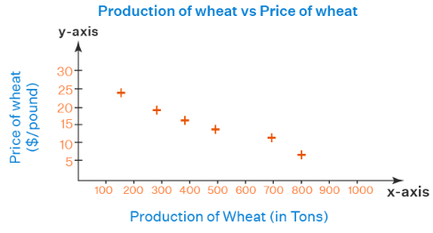
Scatter Plot for Null Correlation
A scatter plot with no clear increasing or decreasing trend in the values of the variables is said to have no correlation. Here the points are distributed randomly across the graph. For example, the data for the number of birds on a tree at different times of the day does not show any correlation. Observe the below scatter plot showing the number of birds on a tree versus time of the day.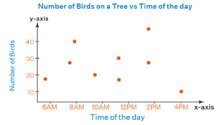
What is Scatter Plot Analysis?
Analysis of a scatter plot helps us understand the following aspects of the data.
- The different levels of correlation among the data points are useful to understand the relationship within the data.
- A line of best fit can be drawn for the given data and used to further predict new data values.
- The data points lying outside the given set of data can be easily identified to find the outliers.
- The grouping of data points in a scatter plot can be identified as different clusters within the data.
|
433 videos|220 docs|166 tests
|


