Simple correlation and regression | Management Optional Notes for UPSC PDF Download
Introduction
When two variables, such as x and y, fluctuate together either in tandem or in opposite directions, they are described as being correlated or associated. Correlation denotes the connection between these variables, which is often observed in certain types of data. For instance, a correlation is evident between income and expenditure, absenteeism and production, or advertisement expenses and sales. However, the nature of correlation can vary depending on the specific variables being examined.
Scatter Diagram
To analyze such relationships, scatter diagrams are utilized. These diagrams plot different datasets on a graph, providing valuable insights. Firstly, they allow us to visually identify patterns between variables, indicating whether there is a relationship between them. Secondly, if a relationship is present, the scatter diagram can provide clues about the type of correlation that exists. Various types of correlations can be observed through scatter diagrams, as depicted in Figure.
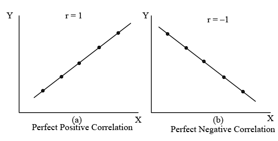
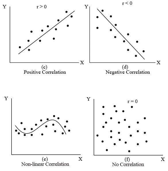
Figure: Possible Relationships Between Two Variables, X and Y
- When the variables X and Y move in the same direction, meaning both increase or decrease simultaneously, the relationship between them is termed as positive correlation [refer to Fig. (a) and (c)]. Conversely, if X and Y variables move in opposite directions, where one increases while the other decreases or vice versa, the relationship is referred to as negative correlation [refer to Fig. (b) and (d)]. When changes in variable X do not affect variable Y, the relationship between them is considered uncorrelated [refer to Fig. (f)]. If the variations in X correspond to a constant ratio of variations in Y, it indicates a linear correlation [refer to Fig. (a) to (d)]; otherwise, it suggests a non-linear or curvilinear correlation [refer to Fig. (e)]. Given that analyzing non-linear correlation entails greater complexity, it's commonly assumed that the association between two variables is linear.
- When the relationship involves only two variables, it is termed as simple correlation. An example elucidating the concept of simple correlation can be found in the illustration that links advertising expenditure to a company's sales.
Illustration 1
Table : A Company’s Advertising Expenses and Sales Data (Rs. in crore)

The sales manager of the company asserts that the fluctuations in sales result from the marketing department's frequent alterations in advertising expenditure. While confident that a relationship exists between sales and advertising, the manager is uncertain about the nature of this relationship. The various scenarios illustrated in Figure represent potential descriptions of the relationship between sales and advertising expenditure for the company. To ascertain the precise relationship, we need to create a scatter diagram, as depicted in Figure, taking into account the values provided in Table.
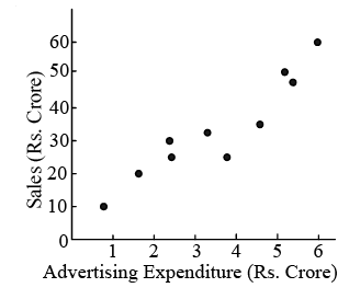
Figure: Scatter Diagram of Sales and Advertising Expenditure for a Company.
Figure indicates that advertising expenditure and sales seem to be linearly (positively) related. However, the strength of this relationship is not known, that is, how close do the points come to fall on a straight line is yet to be determined. The quantitative measure of strength of the linear relationship between two variables (here sales and advertising expenditure) is called the correlation coefficient. In the next section, therefore, we shall study the methods for determining the coefficient of correlation.
[Intext Question]
The Correlation Coefficient
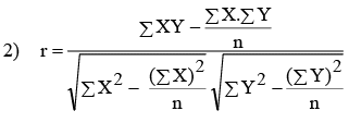
As explained above, the coefficient of correlation helps in measuring the degree of relationship between two variables, X and Y. The methods which are used to measure the degree of relationship will be discussed below. Karl Pearson’s Correlation Coefficient Karl Pearson’s coefficient of correlation (r) is one of the mathematical methods of measuring the degree of correlation between any two variables X and Y is given as:

The simplified formulae (which are algebraic equivalent to the above formula) are:

Note: This formula is used when are integers.
Before we delve into an example to gauge the degree of correlation, it's important to highlight several key points:
- 'r' is a dimensionless number ranging from +1 to -1. A value of +1 signifies a perfect positive correlation, while -1 indicates a perfect negative correlation. A value of 0 denotes no correlation. Figure 10.1 displays several scatter plots with corresponding correlation coefficient values.
- The correlation coefficient is a unit-free measure and remains unaffected by the units of measurement of the variables.
- The correlation coefficient remains unchanged despite alterations in the origin and scale of the X and Y values.
It's crucial to exercise caution when interpreting correlation results. Although a change in advertising might lead to a change in sales, a correlated relationship between two variables does not necessarily imply a cause-and-effect relationship. Often, two seemingly unrelated variables may exhibit high correlation. For instance, significant correlation may be observed between individuals' height and income, or between shoe size and exam scores, despite the absence of any conceivable causal relationship. This type of correlation is termed spurious or nonsense correlation. Hence, it's essential to refrain from drawing conclusions solely based on spurious correlation.
Illustration 2: To illustrate, considering the data of advertisement expenditure (X) and sales (Y) of a company over ten years as presented in Table, we proceed to compute the correlation coefficient between these variables.
Solution: Refer to Table for the Calculation of Correlation Coefficient.
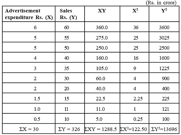
We know that
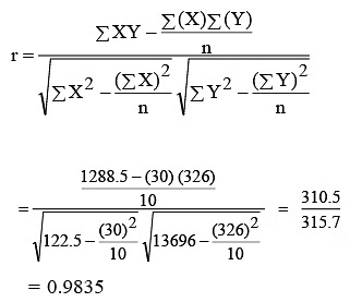
The calculated coefficient of correlation r = 0.9835 shows that there is a high degree of association between the sales and advertisement expenditure. For this particular problem, it indicates that an increase in advertisement expenditure is likely to yield higher sales. If the results of the calculation show a strong correlation for the data, either negative or positive, then the line of best fit to that data will be useful for forecasting (it is discussed in Section on ‘Simple Linear Regression’).
You may notice that the manual calculations will be cumbersome for real life research work. Therefore, statistical packages like minitab, SPSS, SAS, etc., may be used to calculate ‘r’ and other devices as well.
Testing for the Significance of the Correlation Coefficient
- Once the coefficient of correlation has been obtained from sample data one is normally interested in asking the questions: Is there an association between the two variables? Or with what confidence can we make a statement about the association between the two variables? Such questions are best answered statistically by using the following procedure.
- Testing of the null hypothesis (testing hypothesis and t-test are discussed in detail in Units 15 and 16 of this course) that population correlation coefficient equals zero (variables in the population are uncorrelated) versus alternative hypothesis that it does not equal zero, is carried out by using t-statistic formula.

Referring to the table of t-distribution for (n–2) degree of freedom, we can find the critical value for t at any desired level of significance (5% level of significance is commonly used). If the calculated value of t (as obtained by the above formula) is less than or equal to the table value of t, we accept the null hypothesis (H0), meaning that the correlation between the two variables is not significantly different from zero.
The following example will illustrate the use of this test.
Illustration 3
Suppose, a random sample of 12 pairs of observations from a normal population gives a correlation coefficient of 0.55. Is it likely that the two variables in the population are uncorrelated?
Solution: Let us take the null hypothesis (H0) that the variables in the population are uncorrelated.
Applying t-test,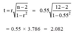
From the t-distribution (refer the table given at the end of this unit) with 10 degrees of freedom for a 5% level of significance, we see that the table value of t0.05/2, (10–2) = 2.228. The calculated value of t is less than the table value of t. Therefore, we can conclude that this r of 0.55 for n = 12 is not significantly different from zero. Hence our hypothesis (H0) holds true, i.e., the sample variables in the population are uncorrelated.
Spearman’s Rank Correlation
The Karl Pearson’s correlation coefficient, discussed above, is not applicable in cases where the direct quantitative measurement of a phenomenon under study is not possible. Sometimes we are required to examine the extent of association between two ordinally scaled variables such as two rank orderings. For example, we can study efficiency, performance, competitive events, attitudinal surveys etc. In such cases, a measure to ascertain the degree of association between the ranks of two variables, X and Y, is called Rank Correlation. It was developed by Edward Spearman, its coefficient (R) is expressed by the following formula:
 squares of difference between the ranks of two variables.
The following example illustrates the computation of rank correlation coefficient.
Illustration 5
Salesmen employed by a company were given one month training. At the end of the training, they conducted a test on 10 salesmen on a sample basis who were ranked on the basis of their performance in the test. They were then posted to their respective areas. After six months, they were rated in terms of their sales performance. Find the degree of association between them.
Solution: Table: Calculation of Coefficient of Rank Correlation.
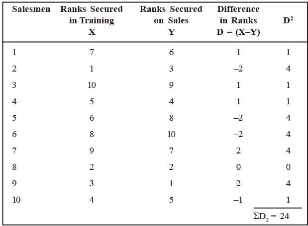
Using the Spearman’s formula, we obtain
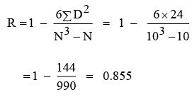
we can say that there is a high degree of positive correlation between the training and sales performance of the salesmen. Now we proceed to test the significance of the results obtained. We are interested in testing the null hypothesis (H0) that the two sets of ranks are not associated in the population and that the observed value of R differs from zero only by chance. The test that is used is t-statistic.
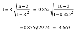
Referring to the t-distribution table for 8 d.f (n–2), the critical value for t at a 5% level of significance [t0.05/2, (10–2)] is 2.306. The calculated value of t is greater than the table value. Hence, we reject the null hypothesis concluding that performance in training and on sales are closely associated.
Sometimes the data, relating to qualitative phenomenon, may not be available in ranks, but values. In such a situation the researcher must assign the ranks to the values. Ranks may be assigned by taking either the highest value as 1 or the lowest value as 1. But the same method must be followed in case of both variables.
Tied Ranks
Sometimes there is a tie between two or more ranks in the first and/or second series. For example, there are two items with the same 4th rank, then instead of awarding 4th rank to the respective two observations, we award 4.5 (4+5/2) for each of the two observations and the mean of the ranks is unaffected. In such cases, an adjustment in the Spearman’s formula is made. For this, Σ d2 is increased by (t3 − t)/12 for each tie, where t stands for the number of observations in each tie. The formula can thus be expressed as:

[Intext Question]
Simple Linear Regression
- When we identify the fact that the correlation exists between two variables, we shall develop an estimating equation, known as regression equation or estimating line, i.e., a methodological formula, which helps us to estimate or predict the unknown value of one variable from known value of another variable. In the words of Ya-Lun-Chou, “regression analysis attempts to establish the nature of the relationship between variables, that is, to study the functional relationship between the variables and thereby provide a mechanism for prediction, or forecasting.”
- For example, if we confirmed that advertisment expenditure (independent variable), and sales (dependent variable) are correlated, we can predict the required amount of advertising expenses for a given amount of sales or vice-versa. Thus, the statistical method which is used for prediction is called regression analysis. And, when the relationship between the variables is linear, the technique is called simple linear regression.
- Hence, the technique of regression goes one step further from correlation and is about relationships that have been true in the past as a guide to what may happen in the future. To do this, we need the regression equation and the correlation coefficient. The latter is used to determine that the variables are really moving together.
The objective of simple linear regression is to represent the relationship between two variables with a model of the form shown below:

wherein Yi = value of the dependent variable,
β0 = Y-intercept,
β1 = slope of the regression line,
Xi = value of the independent variable,
ei = error term (i.e., the difference between the actual Y value and the value of Y predicted by the model.
Estimating the Linear Regression
If we consider the two variables (X variable and Y variable), we shall have two regression lines. They are:
- Regression of Y on X
- Regression of X on Y.
The first regression line (Y on X) estimates value of Y for given value of X. The second regression line (X on Y) estimates the value of X for given value of Y. These two regression lines will coincide, if correlation between the variable is either perfect positive or perfect negative.
- When constructing regression lines using a scatter diagram, as illustrated earlier in Fig, we encounter an infinite number of possible regression lines for a given set of data points. Consequently, it becomes necessary to establish a criterion for selecting the optimal line. This criterion is known as the Least Squares Method.
- According to the least squares criterion, the best regression line is the one that minimizes the sum of squared vertical distances between the observed (X, Y) points and the regression line. In other words, the sum of (Y - Ŷ)2 is minimized, and the sum of positive and negative deviations equals zero (∑ (Y - Ŷ) = 0). It's worth noting that the distance between (X, Y) points and the regression line is referred to as the 'error.'
Regression Equations:
As mentioned earlier, there are two regression equations, also known as estimating equations, corresponding to the two regression lines (Y on X and X on Y). These equations serve as algebraic expressions of the regression lines and are formulated as follows: Regression Equation of Y on X
Regression Equation of Y on X can be expressed as Ŷ = a + bx, where Ŷ represents the computed values of Y (dependent variable) based on the relationship for a given X. In this equation, 'a' and 'b' are constants (fixed values), where 'a' determines the level of the fitted line at the Y-axis (Y-intercept), 'b' determines the slope of the regression line, and X represents a given value of the independent variable.
An alternative simplified expression for the above equation is:
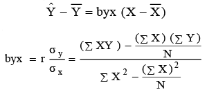
The regression equation of X on Y can be represented as X = a + by. An alternative simplified expression for this equation is: X − X = bxy (Y − Y ).
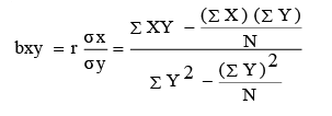
It is worthwhile to note that the estimated simple regression line always passes through  (which is shown in Figure). The following illustration shows how the estimated regression equations are obtained, and hence how they are used to estimate the value of y for given x value.
Illustration 6
From the following 12 months sample data of a company, estimate the regression lines and also estimate the value of sales when the company decided to spend Rs. 2,50,000 on advertising during the next quarter.

Solution: Table: Calculations for Least Square Estimates of a Company.
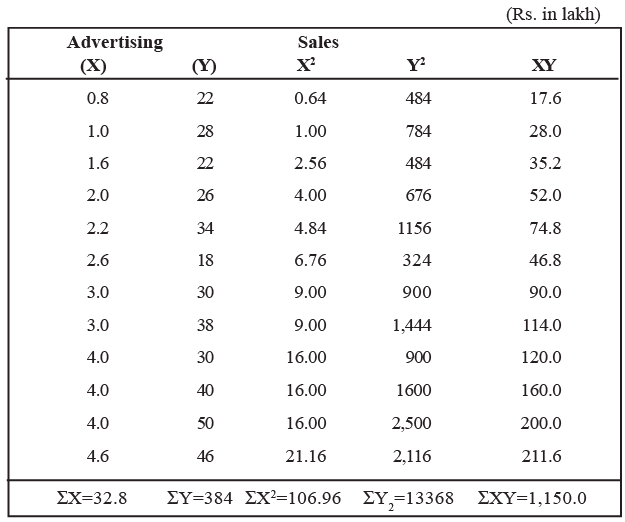
Now we establish the best regression line (estimated by the least square method). We know the regression equation of Y on X is:
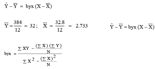
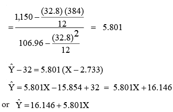
which is shown in Figure. Note that, as said earlier, this line passes through X (2.733) and Y(32).
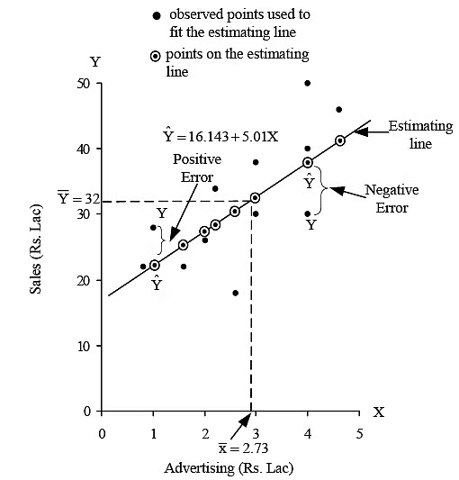
Figure: The Least Squares Regression Line for a Company's Advertising Expenditure and Sales.
- It's important to recognize that the relationship depicted by the scatter diagram may differ if the estimating equation is extrapolated beyond the data points considered in computing the regression equation.
- Regression, a statistical technique, serves predictive purposes across various applications, from forecasting sales demand to predicting production and output levels.
- In the preceding example (Illustration 6), we derived the regression model for the company to predict sales as follows:
 , where Ŷ represents the estimated sales for a given value of X (level of advertising expenditure).
 - To determine Ŷ, the estimated expected sales, we substitute the specified advertising level into the regression model. For example, if we know that the company’s marketing department has decided to spend Rs. 2,50,000/- (X = 2.5) on advertisement during the next quarter, the most likely estimate of sales (Ŷ) is :

Thus, an advertising expenditure of Rs. 2.5 lakh is estimated to generate sales for the company to the tune of Rs. 30,64,850. Similarly, we can also establish the best regression line of X on Y as follows: Regression Equation of X on Y
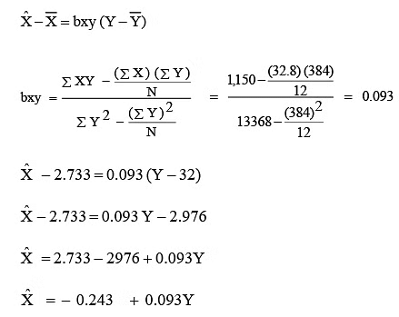
The following points about the regression should be noted:
- The geometric mean of the two regression coefficients (byx and bxy) gives coefficient of correlation.

Consider the values of regression coefficients from the previous illustration to know the degree of correlation between advertising expenditure and sales.

- Both the regression coefficients will always have the same sign (+ or –).
- Coefficient of correlation will have the same sign as that of regression coefficients. If both are positive, then r is positive. In case both are negative, r is also negative. For example, bxy = –1.3 and byx = –0.65, then r is:

- Regression coefficients are independent of change of origin, but not of scale.
[Intext Question]
Standard Error of Estimate
- The next step in regression analysis, following the establishment of the line of best fit, involves assessing the reliability of the estimated regression equation.
- Statisticians have devised a method to gauge the reliability of the estimated regression equation, known as the "Standard Error of Estimate (Se)." This Se bears resemblance to the standard deviation discussed in Unit-9 of this course.
- Recalling that the standard deviation quantifies the dispersion of a distribution around its mean, similarly, the standard error of estimate evaluates the variability or spread of observed values around the regression line. Both can be considered as measures of variability. A larger Se indicates a greater dispersion of data points around the regression line. Conversely, if Se equals zero, all data points would precisely align on the regression line, rendering the estimated equation a perfect estimator. The formula to compute Se is expressed as:

where, Se is standard error of estimate, Y is values of the dependent variable, Ŷ is estimated values from the estimating equation that corresponds to each Y value, and n is the number of observations (sample size).
Let us take up an illustration to calculate Se in a given situation.
Illustration 7: Consider the following data relating to the relationships between expenditure on research and development, and annual profits of a firm during 1998–2004.

The estimated regression equation in this situation is found to be Ŷ = 14.44 + 4.31x . Calculate the standard error of estimate.
Note: Before proceeding to compute Se you may calculate the regression equation of Y on X on your own to ensure whether the given equation for the above data is correct or not.
Solution: To calculate Se for this problem, we must first obtain the value of ∑ (Y − Ŷ) 2 . We have done this in Table.
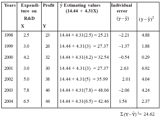
We can, now, find the standard error of estimate as follows.
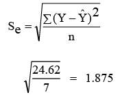
Standard error of estimate of annual profit is Rs. 1.875 lakh.
We also notice, as discussed in Section 10.5, that ∑ (Y −Ŷ) = 0 . This is one way to verify the accuracy of the regression line fitted by the least square method.
Coefficient of Determination
- Coefficient of determination (R2) measures the percentage of variation in the dependent variable which is explained by the independent variable. R2 can be any value between 0 and 1. It is used by many decision-makers to indicate how well the estimated regression line fits the given (X, Y) data points. If R2 is closer to 1, the better the fit which in turn implies greater explanatory power of the estimated regression equation and, therefore, better prediction of the dependent variable. On the other hand, if R2 is closer to 0 (zero), it indicates a very weak linear relationship. Thus prediction should not be based on such weak estimated regression. R2 is given by:


- Please note: In the context of simple regression analysis, there exists an alternative method for calculating R2, as indicated by the following equation: R2 = r2, where R2 represents the coefficient of determination and r denotes the simple correlation coefficient.
- For reference, consider Illustration 6, where we have derived 'r' utilizing regression coefficients (bxy and byx). As an illustration, for R2, we have: r = 0.734, thus R2 = r2 = 0.7342 = 0.5388. This signifies that 53.88 percent of the variance in sales (Y) can be elucidated by the level of advertising expenditure (X) for the company.
Difference Between Correlation and Regression
After gaining an understanding of the concept and application of simple correlation and simple regression, we can discern the differences between them.
- The correlation coefficient 'r' between two variables (X and Y) serves as a metric for the direction and strength of the linear relationship between them, which is bidirectional. It exhibits symmetry (i.e., rxy = ryx), and it is immaterial which of X and Y is considered the dependent variable or the independent variable. Conversely, regression analysis seeks to establish the functional relationship between the two variables under scrutiny and subsequently utilize this relationship to forecast the value of the dependent variable for any given value of the independent variable.
- The nature of the variables (i.e., which serves as the dependent variable and which as the independent variable) is reflected upon. Consequently, regression coefficients are asymmetric in X and Y (i.e., byx ≠ bxy).
- Correlation does not necessarily imply a cause-and-effect relationship between the variables under examination. Conversely, regression analysis explicitly identifies the cause-and-effect relationship between the variables. The variable associated with the cause is designated as the independent variable, whereas the variable linked to the effect is deemed the dependent variable.
- The correlation coefficient 'r' serves as a relative measure of the linear relationship between the X and Y variables and is unaffected by the units of measurement. It ranges between ±1. On the other hand, the regression coefficient byx (or bxy) represents an absolute measure denoting the change in the value of the variable Y (or X) for a unit change in the value of the variable X (or Y). Once the functional form of the regression curve is determined, by substituting the value of the dependent variable, we can obtain the value of the independent variable, which will be expressed in the unit of measurement of the variable.
- Spurious (non-sense) correlation between two variables may occur by pure chance and lacks practical relevance. For instance, the correlation between shoe size and the income of a group of individuals. However, there is no analogous concept of spurious regression.
- Correlation analysis is restricted to investigating linear relationships between variables, thereby having limited applications. In contrast, regression analysis encompasses broader applications as it examines both linear and non-linear relationships between variables.
Conclusion
- In this unit, we've delved into the fundamental principles and methodologies of correlation (or association) and simple linear regression. Scatter diagrams have been utilized to showcase typical patterns indicating various types of relationships. While a scatter plot of variables might suggest a connection between them, the Karl Pearson's correlation coefficient (r) quantifies the strength of this association. A correlation coefficient closer to ±1.0 signifies a stronger linear relationship between the variables. We've also discussed the significance test for the correlation coefficient and outlined Spearman's rank correlation for data involving ranks.
- Upon establishing the presence of correlation between variables, we explored the development of an estimating equation, known as the regression equation, using the least squares method for predictive purposes. Additionally, we introduced a statistical test known as the Standard Error of Estimate to gauge the precision of the estimated regression equation.
- Finally, we've emphasized the conceptual distinctions between correlation and regression. Both correlation and regression analysis techniques find extensive application in business decision-making and data analysis endeavors.


