Chapter Notes - Presentation of Data


Introduction
- You have already learned how to collect and organise data in previous chapters.
- However, just gathering and arranging data is not enough.
- Pages filled with raw numbers and figures are difficult to understand without proper presentation.
- To truly understand and analyse data, it needs to be presented in a clear, compact and engaging manner.
- This chapter focuses on the art of presenting data effectively so that it becomes both usable and easy to comprehend.
Forms of Presentation of Data
Generally, data can be presented in three main forms:
- Textual / Descriptive Presentation
- Tabular Presentation
- Diagrammatic Presentation
Textual / Descriptive Presentation of Data
In textual presentation, data is explained within the running text. This method is suitable when the quantity of data is small and when emphasis on particular facts or events is required. Its main advantage is clarity for small datasets; its main disadvantage is that it becomes long and hard to follow when data is large.
Case 1:
During a bandh on 08 September 2005 protesting the increase in petrol and diesel prices, 5 petrol pumps remained open while 17 were closed. Additionally, 2 schools were closed and 9 schools continued to operate in a town in Bihar.
Case 2:
According to the Census of India 2001, the population of India had reached 102 crores, with 49 crores being females and 53 crores males. Of the total population, 74 crores lived in rural areas, while 28 crores resided in urban areas. There were 62 crores non-workers compared to 40 crores workers. The urban population had a higher proportion of non-workers (19 crores) compared to workers (9 crores), whereas in rural areas there were 31 crores of workers out of a total population of 74 crores.
In both examples, the information is presented entirely through text. The reader must read through the full passage to locate specific facts; however, textual presentation can be very effective when highlighting or explaining particular points.
Try yourself: What are the three main forms of data presentation mentioned in the text?
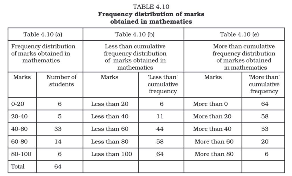
Tabular Presentation of Data
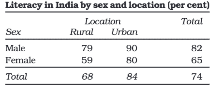
In tabular presentation, data is arranged systematically in rows (horizontal) and columns (vertical). A cell is the box at the intersection of a row and a column and contains one data value or entry. For example, a literacy table may have three rows (male, female, total) and three columns (urban, rural, total), forming a 3 × 3 table with nine cells.
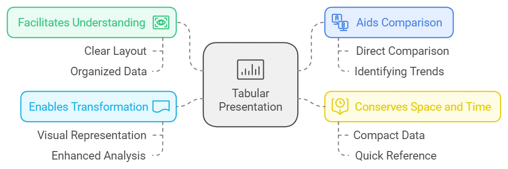
The major advantage of tabulation is that it organises data for easy comparison and further statistical analysis. Tabular data can be converted easily into diagrams or graphs for visual interpretation.
Types of Classification used in Tabulation
Classification organises data into meaningful groups. Common types are:
Qualitative Classification
Data classified by attributes such as social status, nationality, gender, occupation, etc. For example, gender (male, female) and location (urban, rural) in a literacy table are qualitative classifications.
Quantitative Classification
Data classified by measurable characteristics such as age, height, income or production. Classes (groups) are formed by specifying class limits. For example, age groups 0-14, 15-24, 25-44, etc., with population counts for each group.
Temporal Classification
Data organised according to time periods: hours, days, weeks, months, years, decades, etc. Time-series tables are temporal classifications.
Spatial Classification
Data classified by location: village, town, district, state, region, country, etc. Spatial classification helps compare geographic differences.
Objectives of Tabulation
- The primary benefit of tabulation is that it organises data for further statistical analysis and decision-making.
- It helps in the comparison of different sets of data.
- Tabular presentation saves both space and time.
- Data in tables can be easily turned into diagrams and graphs.
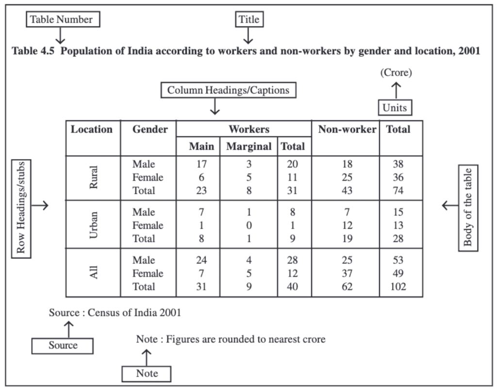
Parts of a Table
- Table Number: Identification number assigned when there are many tables; usually placed at the top or just before the title (for example, Table 4.5).
- Title: A concise description of the contents of the table, placed below the table number.
- Captions (Column Headings): Headings at the top of each column explaining the data in that column.
- Stubs (Row Headings): Headings for each row, usually placed in the left column (stub column).
- Body of the Table: The main area containing the data entries; each cell shows information linking the row and column attributes.
- Unit of Measurement: The units used (for example, crores, percentages, rupees); should be mentioned in the title or within the table where necessary.
- Source: The origin of the data; if multiple sources are used, all should be listed at the bottom of the table.
- Note: Additional explanations, definitions or clarifications about data, if required.
Try yourself: What is qualitative classification?
Diagrammatic Presentation of Data
Diagrammatic (or graphical) presentation turns numbers into visual forms. Diagrams usually convey information faster than tables or text, making trends, patterns and comparisons easier to grasp. Diagrams are less precise than tables but are excellent for summarising and communicating key points.
The most common types of diagrams include:
(i) Geometric Diagrams
(ii) Frequency Diagrams
(iii) Arithmetic Line Graphs
Geometric Diagrams
Geometric diagrams use simple geometric shapes to represent data. The most commonly used geometric diagrams are bar diagrams and pie (circle) diagrams.
Bar Diagram
A bar diagram (bar graph or bar chart) displays grouped data using rectangular bars. Bars have equal width (or consistent width rule) but different lengths/heights representing values. Bar diagrams are suitable for both frequency and non-frequency data and are widely used to compare quantities across categories.
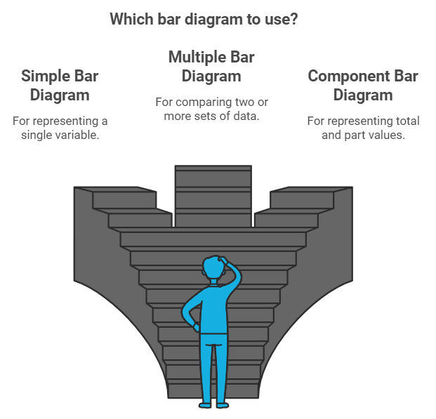
Simple Bar Diagram
- Purpose: To compare data across categories quickly by visually comparing bar heights or lengths.
- Type of Data: Can be used for both frequency and non-frequency data.
- Examples: Family size frequencies, state populations, literacy rates, or production over years.
The taller the bar, the higher the value. Simple bar diagrams are particularly useful for time series data when bars are drawn for successive years or periods to show change.
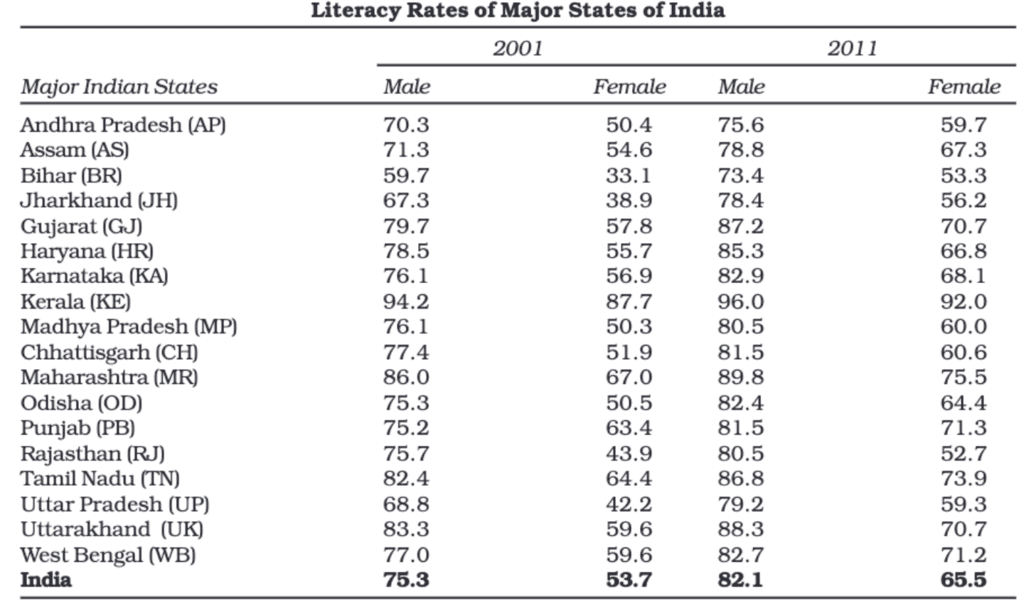
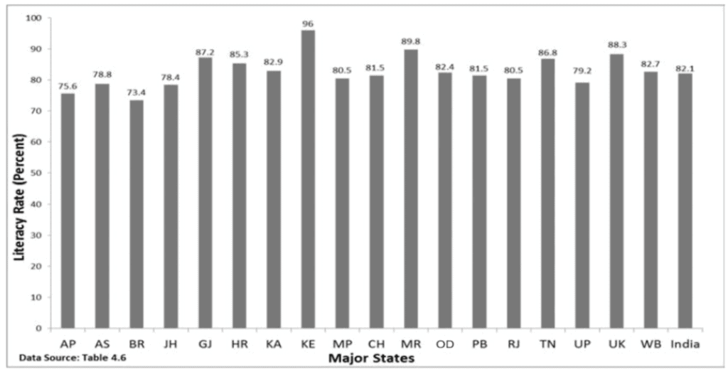
Multiple Bar Diagram
Multiple bar diagrams display two or more datasets side by side for each category so that comparisons between related series are easy. For example, comparing imports and exports or income and expenditure across years uses multiple bar diagrams.
- Purpose: Comparing related datasets (for example, marks of different classes in the same subjects).
- Examples: Comparing population growth of different states across decades.
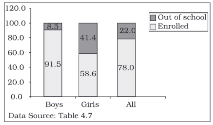
Component Bar Diagram
Component bar diagrams (also called stacked bar diagrams) show how a total is divided into parts for each category. Each bar represents a total and is divided into segments representing components.
- Purpose: To highlight relationships between parts and the whole for each category.
- Examples: Family expenditure broken into food, rent, education; sales from different product categories; population components such as boys, girls and total children for an age group.
- Construction: The height of the bar represents the total value; components are stacked within the bar. For percentage data the total height may be taken as 100 units; smaller components are often placed at the bottom for better visibility and bars are shaded or coloured for clarity.
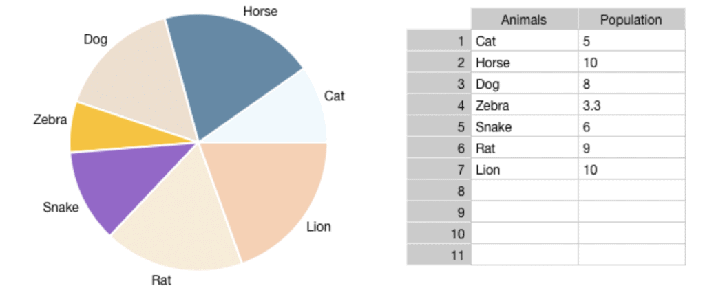
Pie Diagram or Pie Chart
A pie diagram (pie chart) represents a whole as a circle divided into sectors, each sector showing the proportion (share) of a component in the total. Pie charts are particularly useful for showing percentage shares or relative proportions.
- Construction:
1. Compute the percentage share of each component (component value ÷ total value × 100).
2. Convert each percentage point into degrees since the circle is 360°. Each percentage point equals 3.6° (360° ÷ 100).
3. The angle for a component = percentage × 3.6°.
4. Draw straight lines from the centre to the circumference to form the sectors with the calculated angles. - Comparison with Component Bar Diagrams: Both show parts of a whole. Pie charts are visually appealing and good for showing relative shares but are less precise than component bar diagrams. Bar diagrams can display both absolute and percentage values, whereas pie charts require conversion to percentages.
- Example: If 40% of a family's budget is spent on food, the angle for this sector of the pie chart is: \(40 \times 3.6 = 144^\circ\)
Pie diagrams are effective for presenting proportional relationships and for comparing the relative sizes of parts of a whole at a glance.
Try yourself: What is the advantage of using a bar graph to display data?
Frequency Diagrams
Frequency diagrams represent grouped frequency distributions graphically. Common frequency diagrams include the histogram, frequency polygon, frequency curve and ogive.
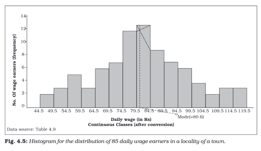
Histogram
A histogram is a two-dimensional diagram made up of adjacent rectangles. It is mainly used for continuous variables. The base (width) of each rectangle corresponds to a class interval and the height corresponds to the frequency or frequency density.

Construction:
- Draw class intervals along the X-axis and frequencies along the Y-axis.
- For each class interval, draw a rectangle whose base equals the class width and whose area (or height, in equal width cases) is proportional to the frequency.
- If class intervals are unequal, use frequency density instead of frequency for heights; frequency density is given by: \(\text{Frequency density} = \dfrac{\text{Frequency}}{\text{Class width}}\)
Characteristics:
- There are no gaps between rectangles because the data is continuous.
- Both width and height of rectangles are important when class widths are unequal.
- The histogram can show the mode graphically by identifying the tallest rectangle or the peak area.
Histograms are suitable for showing distributions of continuous data such as income ranges, ages or marks scored in an examination.
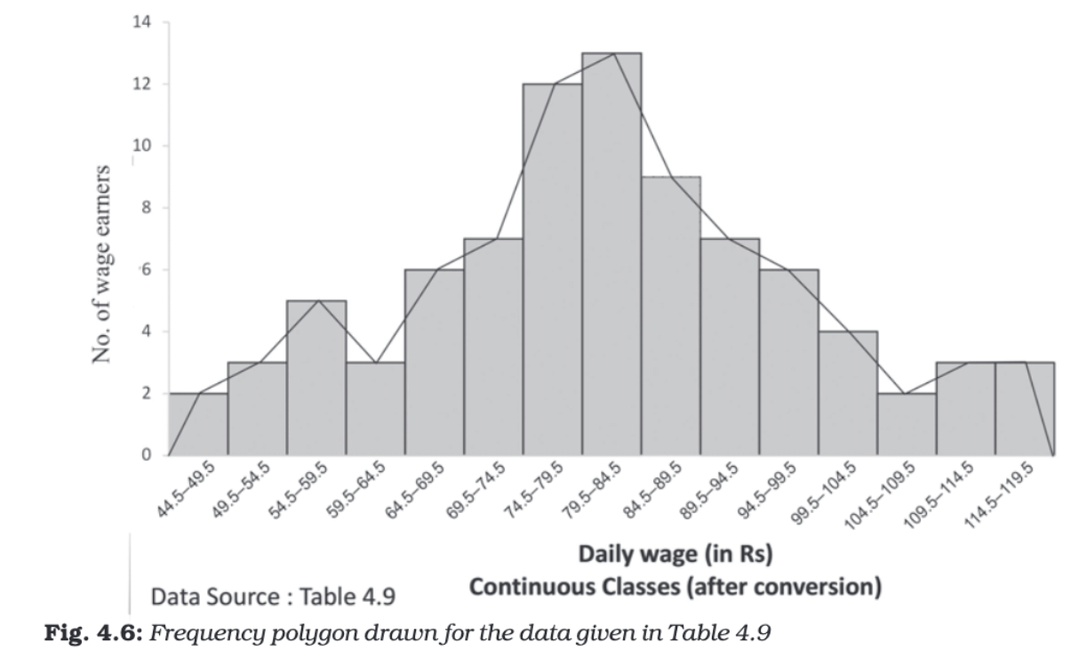
Frequency Polygon
A frequency polygon is a line graph formed by joining the midpoints of the tops of the histogram rectangles. It gives a clear view of the shape of the distribution and is useful when comparing multiple distributions.
- Construction: Plot midpoints of class intervals on the X-axis against frequencies on the Y-axis and join consecutive points by straight lines. Extend the polygon to the mid-value of the previous and next class with zero frequency to close it.
- Characteristics: Easier to compare several distributions on the same graph; the area under the polygon represents the total frequency.
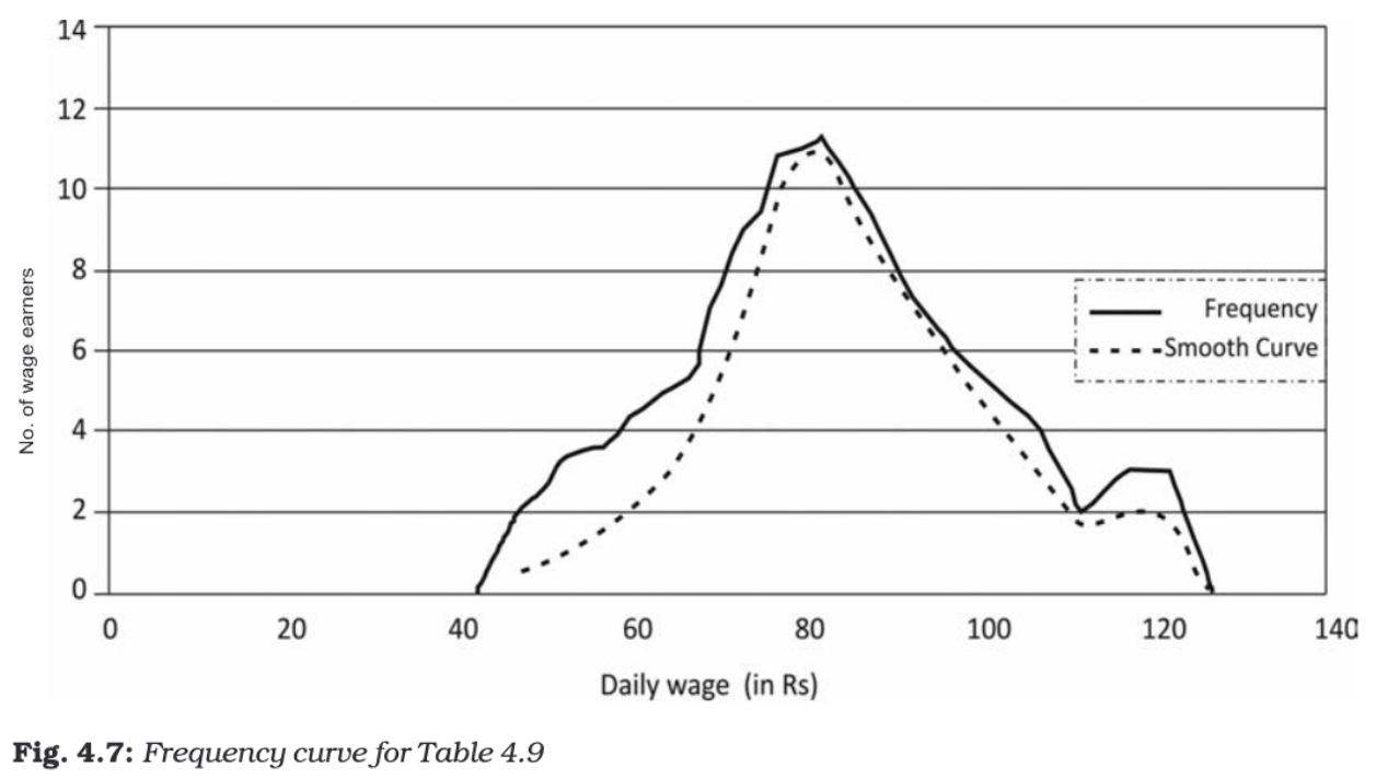
Frequency Curve
A frequency curve is a smooth, freehand curve drawn to pass as closely as possible through the plotted points of a frequency polygon. It emphasises the general pattern or trend of the distribution without the straight-line segments of the polygon.
- Construction: Plot points as for a frequency polygon, then draw a smooth curve through or near the points, avoiding sharp angles.
- Characteristics: Useful for identifying overall patterns and estimating frequencies for values not explicitly in the original grouped data.
Ogive (Cumulative Frequency Curve)
An ogive plots cumulative frequencies and is useful for locating medians, quartiles and percentiles. There are two types:
- Less-than Ogive: Cumulative frequencies (up to the upper-class limits) are plotted against the upper-class limits.
- More-than Ogive: Cumulative frequencies (from the top downward) are plotted against the lower-class limits.
Construction: Plot cumulative frequency points and join them by a smooth curve or straight segments. The Less-than and More-than ogives may be drawn on the same axes for comparison.
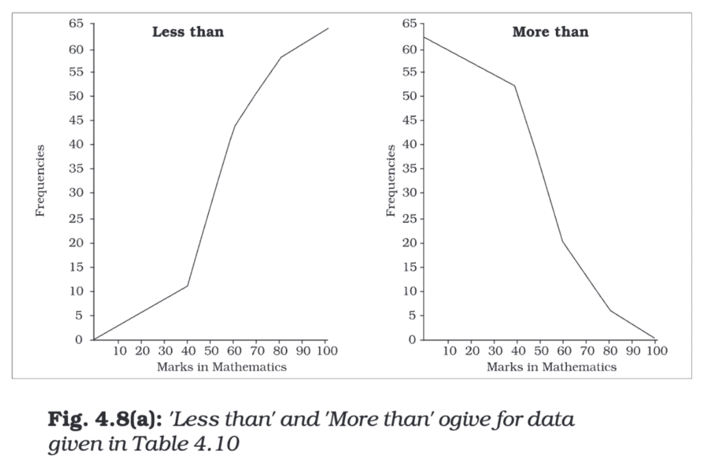
Characteristics:
- The Less-than Ogive increases from left to right as cumulative frequency adds up.
- The More-than Ogive decreases from left to right since it starts from the total and subtracts frequencies.
- The point of intersection of the Less-than and More-than ogives gives the median (the value which divides the distribution into two equal halves); the X-coordinate of the intersection is the median.
Opt
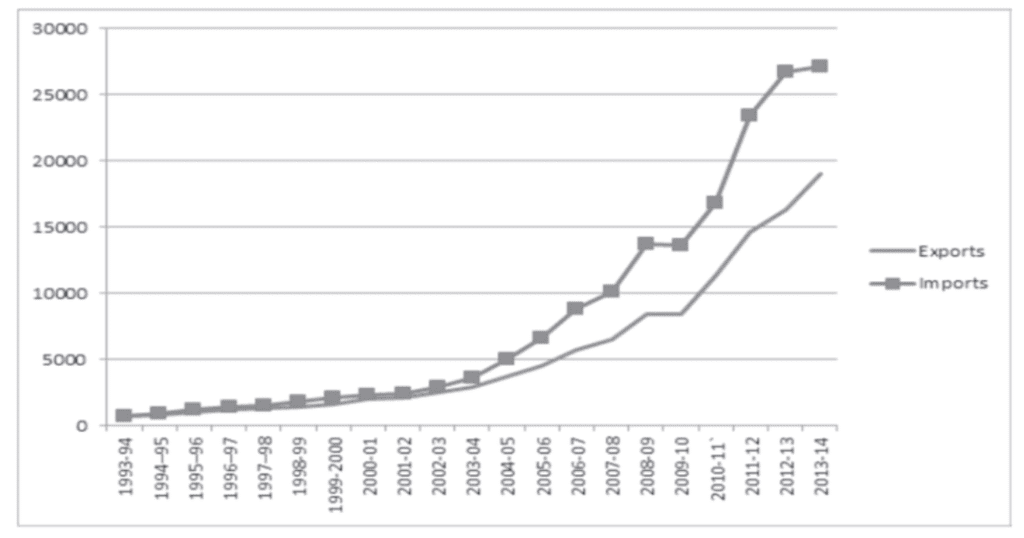
Arithmetic Line Graph
An arithmetic line graph, also called a time-series graph, shows how a variable changes over time. It is formed by plotting points representing the value of the variable at successive times and joining them with straight lines.
Construction:
- X-axis: Represents time (hours, days, months, years, etc.).
- Y-axis: Represents the measured value (sales, temperature, population, imports, exports, etc.).
- Plotted Points: Each point shows the value at a particular time.
- Connecting Points: Consecutive points are joined by straight lines to form the time-series line graph.
Purpose:
- To display trends or patterns over time (increasing, decreasing or constant behaviour).
- To compare two or more time series on the same axes (for example, imports and exports over years).
- To identify periods of rapid change, cyclical effects, seasonality or long-term trends.
Example: Suppose you have data showing the imports and exports of a country from 1993-94 to 2013-14.
- X-axis: Years (1993-94, 1994-95, ..., 2013-14)
- Y-axis: Amount of imports and exports.
- The lines for imports and exports are plotted separately but on the same graph for easy comparison.
- If the line for imports is always above the line for exports, it means imports were always greater than exports.
- If the gap between the lines keeps increasing, it shows that the difference between imports and exports is growing over time.
Conclusion
Presentation of data converts raw numbers into meaningful information. Textual presentation is suitable for small datasets and emphasising details; tabular presentation organises data for comparison and analysis; and diagrammatic presentation converts numbers into visual forms that reveal trends, proportions and patterns quickly. Choosing the correct form-table, bar, pie, histogram, polygon, ogive or time-series graph-depends on the nature of the variable (discrete or continuous), the purpose of presentation and the audience's need for accuracy versus clarity.
FAQs on Chapter Notes - Presentation of Data
| 1. What are the different methods to present data in Economics Class 11? |  |
| 2. How do I create a frequency distribution table for grouped data? | |
| 3. What's the difference between a histogram and a bar chart in data presentation? | |
| 4. Why do we use cumulative frequency curves (ogives) instead of regular frequency graphs? | |
| 5. How do pie charts and pictograms help in comparing proportions of categorical data? | |