Worksheet Solutions: Smart Charts - 2 | Worksheets with solutions for Class 3 PDF Download
Q1: Krishna collected the data on chocolates that need to be donated to an orphanage from his class and represented them in tabular form.
Data of chocolates: Five star-25, Dairy milk-16, Ferrero Rocher-37, Hershey-48, Toblerone -56.
Ans: Below is the representation data in tabular form
Pictograph
- Pictograph, is a type of chart where the data is represented by using pictures.
- There are two rules that need to be followed while making the pictograph, there are: i) A pictograph must have a title, ii) The symbol used in the pictograph must be defined.
Q2: The below board shows the number of students in each class. It also shows the number of students present and absent.
Attendance Board of 21-Mar-2022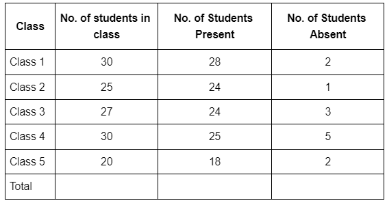
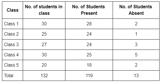
Ans: Attendance Board of 21-Mar-2022
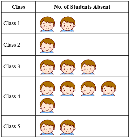
Student Absence Chart
 Tally Marks
- Tally marks are defined in the unary numeral system. It is a form of numeral used for counting.
- Representation of Tally Marks: Tally markers are generally written in a group or as a set of five lines. In this group, the first four lines are drawn vertically, and the fifth line goes diagonally over the first four vertical lines, from top to bottom.

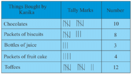
Q3: Kanika bought 10 chocolates, 8 packets of biscuits, 3 bottles of juice, 4 packets of fruit cake and 12 toffees and represented the data using tally marks.
Ans: In the below table we represent the data of Kanika using the tally marks.
Line Chart
- A line chart is a chart created by conducting a series of data points together with a line.
- It is the most basic chart.
- This graph is used to represent information which changes over time.
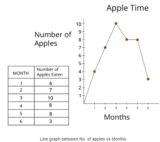
Q4: Doctor Ranjan suggested Krish's grandmother eat as many apples as she can because she is weak for at least for 6months. Dr Ranjan also suggested Krish note the no. of apples eaten by her grandmother every month for around 6 months to track her data.
Ans: First we have to make a table and write the data on how many apples were eaten each month for a total of 6months then according to that data we have to represent it on the line graph. To draw a line graph we have to draw one X-axis and one Y-axis. One axis should represent the number of apples and another axis should represent the months.
Below the graph is a line graph that represents the number of apples eaten by Krish's grandmother each month (for 6 months).
Bar Graph
- Bar Graph is a graphical display of data using bars of different heights.
- Bar Graphs are divided into two types. They are Vertical Bar Graphs and Horizontal Bar Graphs.
- Vertical Bar Graphs: A bar graph or bar chart in which the bars are plotted vertically along the y-axis.
- Horizontal Bar Chart: A bar graph or bar chart in which the bars are plotted horizontally along the x-axis.
Q5: Surya conducted a Survey on how many people consider the below fruits as their favourite fruit: Bananas, Apples, Mangoes, Grapes and Oranges. In the survey, he got the data as mango -20, apple -60, grapes-80, bananas-100 and oranges-45. Represent the above data in both vertical and horizontal bar graphs.
Ans: Below is the vertical bar graph representation of the data of the survey conducted by Surya.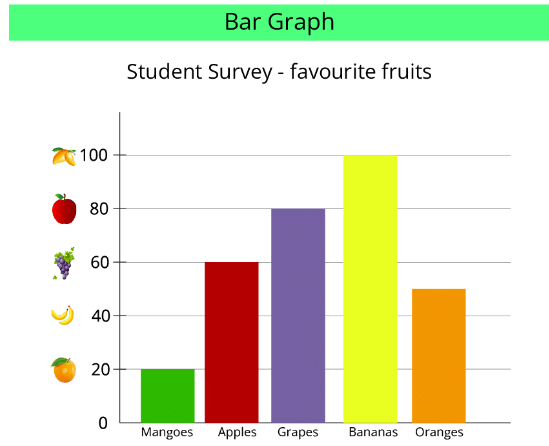 Bar graph between student vs friuts
This is the representation of the above data in the form of a horizontal bar graph.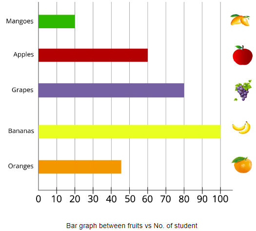
Circle Chart
- It is a type of chart with a shape similar to a round chapati or circle.
- A circle Chart is technically known as a Pie chart.
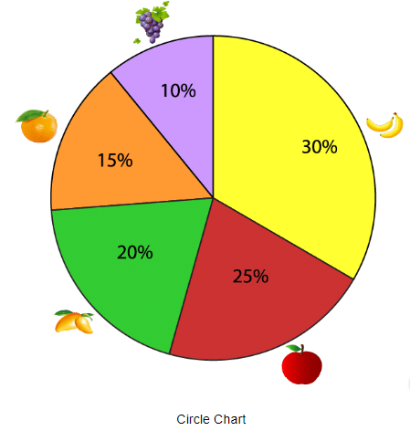
- Here the chart is divided into different sections representing a percentage of the total/relative sizes of data.
- This is also called a circle or sector graph.
- Example: Below pie charts represent the percentage of people who liked the mentioned fruits like apple, banana, orange, kiwi and sweet lemon.
Q6: The given pie chart represents the data of students who want to visit different places. Observe the given pie charts and calculate what percentages of students want to visit museums?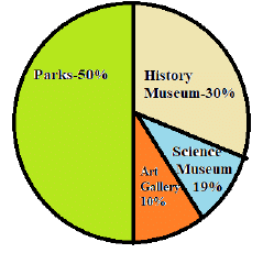
Ans: 49%
Q7: Given the following table shows the most liked breakfast for children.
Answer the following questions on its basis:
(i) Which is the most liked breakfast?
(ii) Which is the least liked breakfast?
(iii) How many children liked both dosa and Idli?
(iv) How many children liked only Bread and Jam?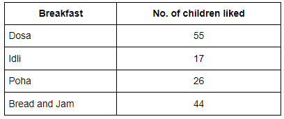
Ans:
(i) Dosa
(ii) Idli
(iii) 72
(iv) 44
FAQs on Worksheet Solutions: Smart Charts - 2 - Worksheets with solutions for Class 3
| 1. What is a Smart Chart? |  |
| 2. How can Smart Charts be useful in data analysis? |  |
| 3. Can Smart Charts be customized to suit specific data analysis needs? |  |
| 4. Are there any limitations to using Smart Charts for data analysis? |  |
| 5. What are some common mistakes to avoid when creating Smart Charts? |  |


