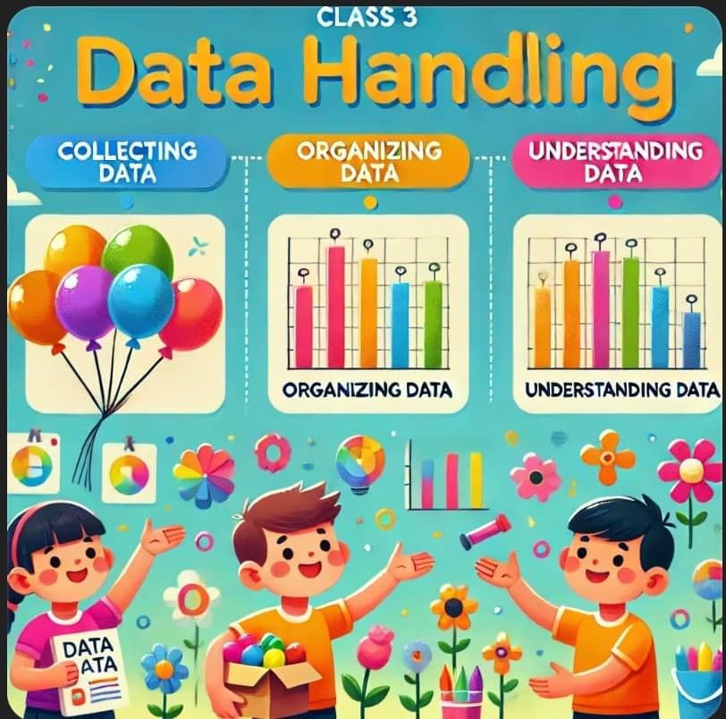
Data Handling Class 3 Notes Maths
| Table of contents |
|
| What Is Data Handling? |
|
| What Do We Do with Data? |
|
| Types of Data |
|
| How We Represent Data? |
|
| What is a Pictograph? |
|
| What is a Bar Graph? |
|
| What is a Pie Chart? |
|
| Conclusion |
|

What Is Data Handling?
 Imagine you’re a detective solving a mystery. You need clues, right? In data handling, those clues are the pieces of information we collect every day:
- How many red apples are in a basket?

- Which ice-cream flavour your friends like best?

- How many crayons of each colour you own?
Just like a detective uses clues to crack a case, we use data to learn new things and make smart choices. Let’s dive in and see how fun data can be!
- Data is information we collect (like counts of birds, fish, or toys).
- Handling means organizing and understanding that information.
What Do We Do with Data?
We follow three simple steps:
Collecting Data
– Count or ask questions, for example: “How many blue balloons are in the bunch?”Organizing Data
– Arrange information neatly in tables or charts so it’s easy to read.Understanding Data
– Look for patterns and answers, such as “Which balloon colour is most popular?”
Below is one such example of Collecting, Recording and Interpreting Data of number of students going to school by Bus, Car, Bicycle or Walk
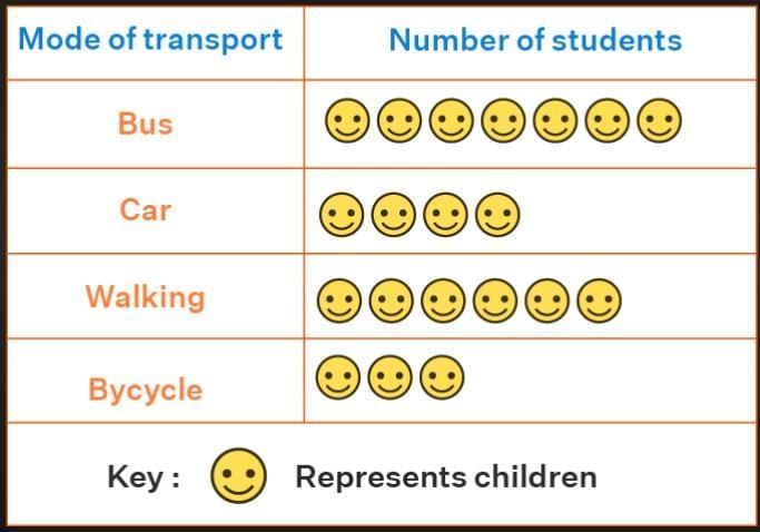 Example Data Handling
Try this!
Ask three classmates their favourite fruit and write down their answers.
Data handling helps us in everyday life—whether counting chocolates, marking attendance in class, or even knowing the weather. It makes information easy to read and use.
Types of Data
Data can be grouped into two main types:
Qualitative Data – This type of data describes things using words, not numbers. It tells us how something looks, feels, or sounds.
- Example: "The apple is red." (Red is a description, not a number.)
- Another Example: "The music is loud."

- Example: "The apple is red." (Red is a description, not a number.)
Quantitative Data – This type of data uses numbers to give information. It tells us "how much" or "how many" of something.
- Example: "I have 5 books." (The number 5 tells us the quantity.)

- Another Example: "The table is 3 feet long."
- Example: "I have 5 books." (The number 5 tells us the quantity.)
How We Represent Data?
There are various ways to represent data but the most common are graphs and charts. There are three main types of graphs and charts:- Pictograph
- Bar Graph
- Pie Chart
What is a Pictograph?
A pictograph uses small pictures or symbols. Each symbol stands for a certain number.
How it works:
- Decide what each picture means (the “key”).
- Draw the correct number of pictures for each category.
Example 1:
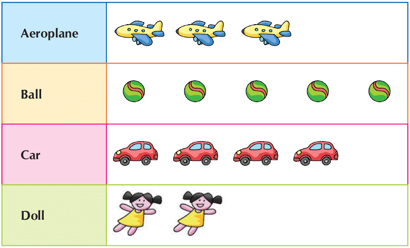 Picture Graph
- A toy shop shows many different toys.
- This drawing is called a picture graph.
- Each toy picture stands for one toy in the shop.
- We can see at a glance which toy there is most of, and which toy is least.
Example 2:
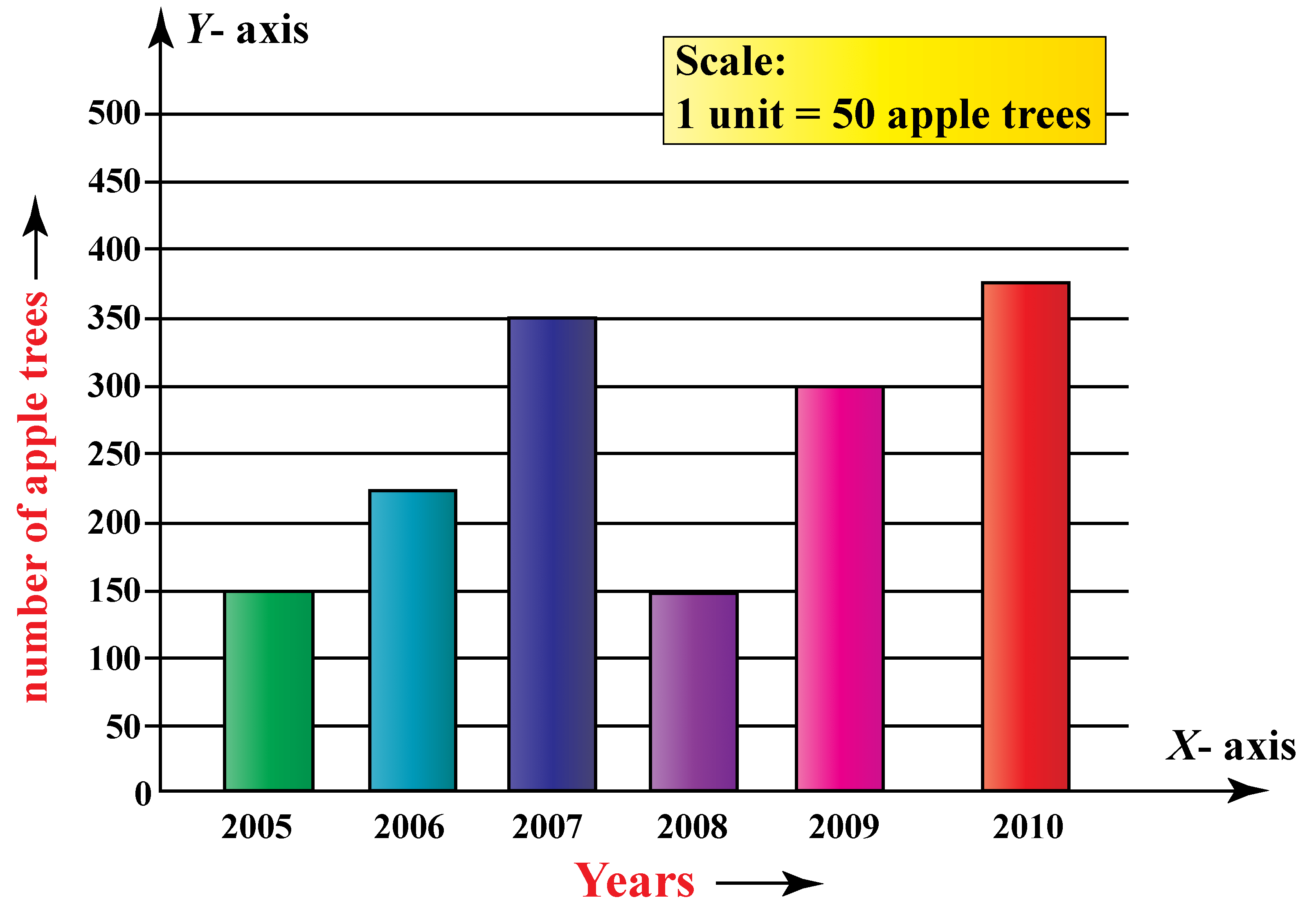
This pictograph shows the number of apples collected from Monday to Friday. Each apple represents 10 apples.
How many apples are collected on Thursday?
(a) 10
(b)20
(c)30
(d) 40
Answer: The answer is option (c) that is 30 apples. As there are 3 apples and each apple denotes 3 apple so in total we will have 30 apples.
What is a Bar Graph?
A bar graph is a way to show data using bars of different heights or lengths. The taller or longer the bar, the bigger the number it represents. It helps us compare different values easily. A bar graph is also called a bar chart or column graph.
 Bar Graph
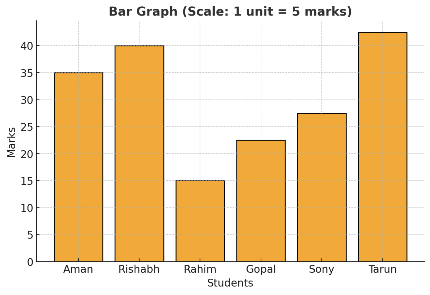
Example:
Check out this cool bar graph showing the marks scored by six students in a test!
Here’s the list of students and their marks:
- Aman → 35 marks
- Rishabh → 40 marks
- Rahim → 20 marks
- Gopal → 25 marks
- Sony → 30 marks
- Tarun→ 45 marks
Now, let's answer some fun questions!
Who scored the highest marks?
Ans: Tarun with 45 marks!Who scored the least marks?
Ans: Rahim with 20 marks.How many more marks did Rishabh score than Gopal?
Ans: Rishabh scored 15 marks more than Gopal (40 - 25 = 15). That's a lot!
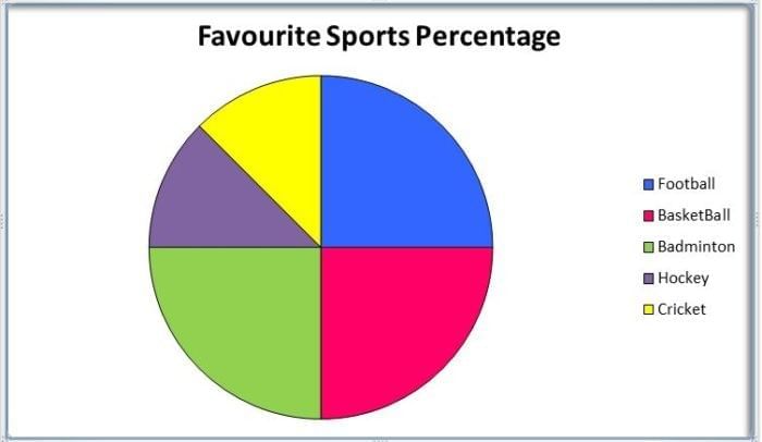
What is a Pie Chart?
A pie chart is a special kind of graph that looks like a circle, and it’s divided into different parts or "slices." Each slice shows a part of the whole thing. The bigger the slice, the bigger the part it represents.
 Pie Chart
Think of it like a pizza! If you have a pizza and cut it into slices, each slice represents a part of the pizza. If one slice is bigger than the others, it means that part of the pizza is bigger than the rest.
Example:
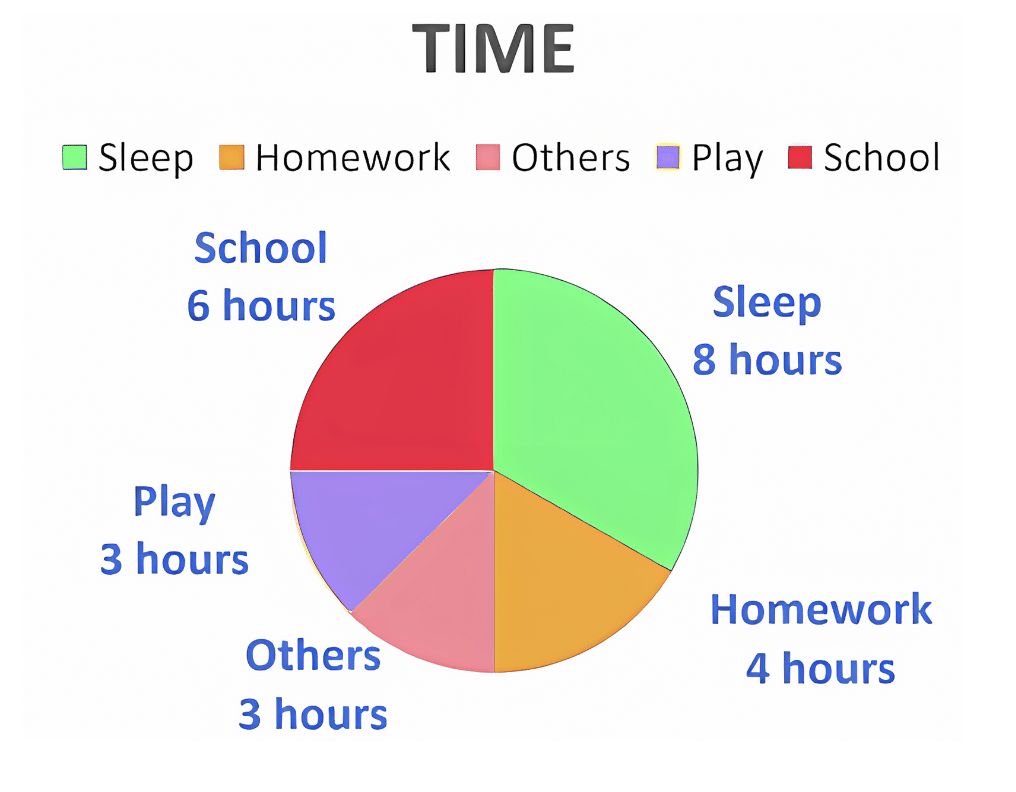
Understanding the Pie Chart – A Day in My LifeThis chart represents how a student spends 24 hours in a day, divided into different activities. Each hour is like a portion of the whole day, and the chart helps us visualize time distribution.
Other Activities (3 hours): This includes daily routines like eating, relaxing, and personal time.
- Sleep (8 hours): A student spends 8 hours sleeping to rest and regain energy.
- School (6 hours): School takes up 6 hours of the day, where learning and activities take place.
- Homework (4 hours): After school, 4 hours are spent completing assignments and studying.
- Playtime (3 hours): Fun activities and play take up 3 hours.
How many hours does a student spend in school according to the chart?
(a) 4 hours
(b) 6 hours
(c) 8 hours
(d) 3 hours
Answer: (b) 6 hours
Conclusion
In conclusion, data handling is a valuable skill that helps us collect, organize, and understand information. By learning to use tools like pictographs, bar graphs, and pie charts, we can easily interpret data and make informed decisions. These methods make complex information simple and fun to explore, enhancing our ability to analyze and present data effectively.
|
37 videos|77 docs|53 tests
|
FAQs on Data Handling Class 3 Notes Maths
| 1. What are the different types of data used in data handling? |  |
| 2. How is data represented visually in graphs and charts? | |
| 3. What is the purpose of a pictograph? | |
| 4. How do you interpret a bar graph? | |
| 5. What information does a pie chart provide? | |


mock tests for examination
,Objective type Questions
,ppt
,Free
,Semester Notes
,Viva Questions
,Exam
,Extra Questions
,Important questions
,study material
,Data Handling Class 3 Notes Maths
,MCQs
,Sample Paper
,practice quizzes
,Summary
,video lectures
,shortcuts and tricks
,Data Handling Class 3 Notes Maths
,past year papers
,Previous Year Questions with Solutions
,Data Handling Class 3 Notes Maths
,


Chapter Notes: Data Handling Free PDF Download
Importance of Chapter Notes: Data Handling
Chapter Notes: Data Handling
Chapter Notes: Data Handling Class 3 Questions
Study Chapter Notes: Data Handling on the App
|
© EduRev
|
Education Revolution
|


|


within 7 days!