Examples (with Solutions): Pie Chart | CSAT Preparation - UPSC PDF Download
Example 1: The following pie chart shows the amount of subscription generated for Indian Bonds from different categories of Investors. 
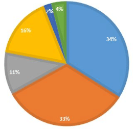
Question 1: If the investment by NRI’s are INR 4,000 crore, then investment by both corporate houses and FII’s together is:
a.) 24000 crores
b.) 24363 crores
c.) 25423.4 crores
d.) 25643.3 crores
Ans: If the investment by NRI is worth 4000 crores which is 11% of total value.
Then, the total value will be = 4000 * 100/11
= 36363.63
Now, investment by corporate houses and FII’s together will be 67% of 36363.63 i.e. 24,363.63 crores.
Question 2: What percentage of total investment is coming from either FII’s or NRI’s?
a.) 33%
b.) 44%
c.) 11%
d.) 22%
Ans 2: This is a very direct question and the answer is 44%.
Question 3: If the total investment other than by FII and corporate houses is INR 335,000 crore, then the investment by NRI’s and offshore funds will be (approximately):
a.) 274,100
b.) 285,600
c.) 293,000
d.) Cannot be determined
Ans 3: This question will be solved in a similar manner like the question 1. The investment other than by FII’s and the corporate house is total is-s 33% amounted to 335,000 crores.
Then total investment by everyone will be 335,000 * 100/33
= 1015151.5151
And NRI’s and offshore funds constitute 27% of total investment. Hence, 0.27 of 1015151.5151 i.e. 274,090.90.
Question 4: What is the approximate ratio of investment flows into India Bonds from NRI’s to corporate houses?
a.) 1:4
b.) 1:3
c.) 3:1
d.) Cannot be determined
Ans 4: Again, this one is a simple one. The investment by NRI’s is 11% and the corporate house is 34%. Therefore, the ratio will be 11:34 i.e. approximately 1:3.
Question 5: In the corporate sector, approximately how many degrees should be there in the central angle?
a.) 120
b.) 121
c.) 122
d.) 123
Ans 5: To solve the question you need to learn how to convert percentage into degrees and it’s pretty simple. You just need to multiply the percentage with 360o i.e. 11/100 * 360o = 39.6o.
Now in this question, we need to find the central angle of the corporate house i.e. 0.34 of 360o i.e. 122.4o.
Question 6: If the total investment flows from FII were to be doubled in the next year and the investment flows from all other sources had remained constant at their existing levels for this year, then what would be the proportion of FII investment in the total investment flows into Indian Bonds in the next year (approximately)?
a.) 40%
b.) 50%
c.) 60%
d.) 70%
Ans 6: FII's currently account for 33 out of 100.
If their value is doubled and all other investments are kept constant then their new value would be 66 out of 133 = approximately equal to 50%
Question 7: If the flow from the FII’s after the doubling (of the previous question) were to the tune of US$ 500 million, what would be the total investment into Indian Bond in US $’s?
a.) 1000
b.) 1500
c.) 800
d.) Cannot be determined
Ans 7: 500 million is 50% of the total investment as we found in the previous question. Thus, the total investment will be 500 * 100/50 i.e. 1000 million dollars.
Example 2: Study the following diagram carefully and answer the questions:
Percentage Composition of Human Body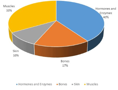
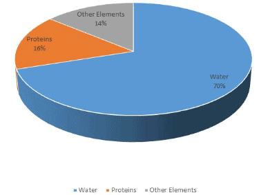
Question 1: What percent of the total weight of the human body is equivalent to the weight of the proteins in the skin in human body?
a.) 0.016
b.) 1.6
c.) 0.16
d.) Cannot be determined
Ans 1: Now to solve this question you have to make use of both the pie charts. Since the total percentage of protein in the body is 16%. And, the total percentage of the weight of skin in the human body is 10%. Therefore, the percentage of protein in skin is 10% of 16.i.e. 1.6.
Question 2: What will be the quantity of water in the body of a person weighing 50 kg?
a.) 20 kg
b.) 35 kg
c.) 41 kg
d.) 5 kg
Ans 2: Water constitutes 70% of the body. Thus, if the man weighs 50 kg then 70% of it will be water. The weight of water will be 35 kgs.
Question 3: What is the ratio of the distribution of proteins in the muscles to that of the distribution of proteins in the bones?
a.) 1:18
b.) 1:2
c.) 2:1
d.) 18:1
Ans 3: Again, using both pie charts we know that 33% of body weight is constituted in muscles whereas 17% in bones and 16% of it will be protein.
Hence, 0.16*33: 0.16*17, which is approximately equal to 2:1.
Question 4: To show the distribution of proteins and the other dry elements in the human body, the arc of the circle should subtend at the centre an angle of;
a.) 54o
b.) 126o
c.) 108o
d.) 252o
Ans 4: Using the formula given in the example 1, Ans 5 we get,
[(16% + 14%)/100] * 360o = 108o.
Question 5: In the human body, what part is made of neither bones nor skin?
a.) 1/40
b.) 3/80
c.) 2/5
d.) None of these
Ans 5: Now let u-s consider the body to be- numeraire as 1 and 17/100 and 10/100 constitutes bones and skin respectively i.e. 1/6 and 1/10
Hence, the required answer is 1 – (1/6 +1/10) = 11/15.
XAT 2012: The following pie chart shows the percentage distribution of runs scored by a batsman in a test innings. 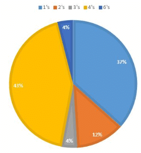
Question 1: If the batsman has scored a total of 306 runs, how many 4’s and 6’s did he hit?
a.) 31 and 3 resp.
b.) 32 and 2 resp.
c.) 32 and 3 resp.
d.) 33 and 1 resp.
e.) 33 and 2 resp.
Ans 1: Total runs scored by a batsman is 306. % of 4’s and 6’s hit by him are 43 and 4 respectively.
Thus, there were 0.43 * 306/4 and 0.04 * 306/6 were 4’s and 6’s resp.
i.e., 33 and 2.
Question 2: If 5 dot balls had been hit for 4s, and if two of the shots for which the batsman scored 3 runs each had fetched him one run instead, what would have been the central angle of the sector corresponding to the percentage of runs scored in 4s?
a.) 160
b.) 163
c.) 165
d.) 167
e.) 170
Ans 2: Since the total runs scored by a batsman is 306 and therefore total no. of runs secured through 4’s are 0.43 of 306 i.e. 132. Now if 5 more fours are added to it the total becomes 152.
Now the overall total runs secured by batsman after adding 5 fours and deducting 2 three’s and simultaneously adding 2 one’s is 306 +16 = 322
The central angle for 4’s would be 152/322 * 360 = 170o.
SNAP 2005: Study the sector-wise sales of a group of companies for the financial year 2004-05 and answer the following question: 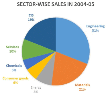
| Sectors | (Rs. Millions) | % Share |
| Materials | 1,64,430 | 21 |
| Engineering | 2,44,830 | 31.2 |
| Energy | 62,990 | 8 |
| Consumer goods | 47,880 | 6.1 |
| Chemicals | 35,510 | 4.5 |
| Communication and Information system | 1,48,160 | 18.9 |
| Services | 78,950 | 10.1 |
| Total | 7,82,750 | |
| *Sales turnover at US$ 17.4 billion (Rs. 78,224 crores) representing year-on-year growth of 30.3 % in dollar terms and 27.4 % in rupee terms. | ||
| *sales figures shown are net of excise duty | ||
Question 1: This group of companies operates in multiple sectors. The holding company has decided to closely monitor a minimum number of sectors (not exceeding 5) contribution together a major part (at least 80%) of sales of the group. Identify the correct set of sectors.
a.) Engineering, Services, CIS & Consumer Goods
b.) Engineering, Services, CIS, Energy & Consumer Goods
c.) Engineering, Materials, Services & CIS
d.) Engineering, Materials, CIS & Energy
Ans 1: The solution to this question is very easy. Just use the pie chart and add the highest 4 contributing sectors i.e. Engineering, Materials, CIS, Services. Their total is
(33+21+19+10) is 91% i.e. more than 80.
Question 2: The average profit against the sales across the sectors is 10% while the profit margin of Engineering is 12% and CIS, 20%. What is the average profit across the remaining sectors?
a.) 5.87%
b.) 6.12%
c.) 4.94%
d.) 4%
Ans 2: Total sales = 782,750.
Average profit = 10% i.e. 78,275
Profit of engineering and CIS respectively are 12% of 244,830 and 20% of 148,160 i.e. 29,379.6 and 29,632.
Hence, the profit of remaining sectors is 78,275 – 59,011.6 = 19,263.4
Thus, % of average profit for rest of the sectors is (19,263.4/ 78,275) * 100/5 = 4.94%.
CAT 2018: The multi-layered pie-chart below shows the sales of LED television sets for a big retail electronics outlet during 2016 and 2017. The outer layer shows the monthly sales during this period, with each label showing the month followed by the sales figure of that month. For some months, the sales figures are not given in the chart. The middle layer shows quarter-wise aggregate sales figures (in some cases, aggregate quarter-wise sales numbers are not given next to the quarter). The innermost layer shows annual sales. It is known that the sales figures during the three months of the second quarter (April, May, June) of 2016 form an arithmetic progression, as do the three-monthly sales figures in the fourth quarter (October, November, December) of that year. 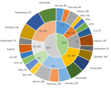
Question 1: What is the percentage increase in sales in December 2017 as compared to the sales in December 2016?
a.) 38.46
b.) 22.22
c.) 50.00
d.) 28.57
Question 2: In which quarter of 2017 was the percentage increase in sales from the same quarter of 2016 the highest?
a.) Q4
b.) Q1
c.) Q2
d.) Q3
Question 3: During which quarter was the percentage decrease in sales from the previous quarter’s sales the highest?
a.) Q2 of 2016
b.) Q2 of 2017
c.) Q4 of 2017
d.) Q1 of 2017
Question 4: During which month was the percentage increase in sales from the previous month’s sales the highest?
a.) October of 2017
b.) October of 2016
c.) March of 2016
d.) March of 2017
Ans: To easily solve the questions we can first represent the information given in the pie-chart in a consolidated table to make it easier to read and understand.
| Month/ sales figure in | 2016 | 2017 | |
| Q1 | January | 80 | 120 |
| February | 60 | 100 | |
| March | 100 | 160 | |
| Q2 | April | 40 | 60 |
| May | 75 | ||
| June | 65 | ||
| Q3 | July | 75 | 60 |
| August | 120 | ||
| September | 55 | 70 | |
| Q4 | October | 100 | 150 |
| November | 170 | ||
| December |
As you can see in the above table there a few month’s sales are missing and we need to evaluate them first from the given information and then find the answers to the above-given question.
Now, it’s been given in the question that the months of April, May, June in 2016 forms an A.P. and so does the months of Quarter 4 of 2016, i.e. Oct, Nov, Dec.
Total sale in Quarter 2 = 150
Let a-d, a, a+d be the three terms of A.P.
Hence, a-d + a + a+d =150
- 3a = 150
- a = 50
Since, April sale is 40, i.e. a-d = 40
- d = 10
Using that we can easily find the rest of the month sales values i.e. 50 and 60 respectively.
Similarly, using the above method we can find out the values for the month of Nov’16 and Dec’16. In this case, a would-be 120 and d = 20.
Thus, sales for these months are 120 and 140 respectively.
Now as you can see in the table, we have found out all missing monthly sales figure except for December’17 and August’17 which can be easily find out as
Total sales in Quarter 4 of 2017 = 500
And sales in Oct’17 and Nov’17 are 150 and 170 respectively.
Hence, the sale for December = 500 -150-170 = 180
And similarly, Sale for August’17 = 220 – 60 – 70 = 90
Therefore, our table becomes,
| Month/ sales figure in | 2016 | 2017 | |||
| Q1 | January | 80 | 240 | 120 | 380 |
| February | 60 | 100 | |||
| March | 100 | 160 | |||
| Q2 | April | 40 | 150 | 60 | 200 |
| May | 50 | 75 | |||
| June | 60 | 65 | |||
| Q3 | July | 75 | 250 | 60 | 220 |
| August | 120 | 90 | |||
| September | 55 | 70 | |||
| Q4 | October | 100 | 300 | 150 | 500 |
| November | 120 | 170 | |||
| December | 140 | 180 | |||
Now we are in a position to answer all the given questions using the above table.
Ans 1: Percentage increase in sales of Dec’17 as compared to Dec’16 = (180 – 140)/140 × 100 = 40/140 × 100 = 28.57%
Ans 2: We need to evaluate the quarter with the highest increase in sales in percentage terms.
| Quarter | Increase in sales | Percentage terms |
| Q1 | 140 | 58.33% |
| Q2 | 50 | 33.33% |
| Q3 | (30) | (12%) |
| Q4 | 200 | 66.67% |
Hence, using the above table we get the answer is Quarter 4
Ans 3: As we can clearly notice above from the table that the decrease in sales is only in quarter 2 of both the years 2016 and 2017.
Decrease in Q2- 2016 = (240 - 150)/240 × 100 = 37.5%
Decrease in Q2- 2017 = (380 - 200)/380 × 100 = 47.37%
Hence, the answer is Quarter 2’2017
Ans 4: As given options are only for may and October and we can see that sales in October 2017 is more than double ( from 70 in November to 150 in October ) so it is highest than other given month. Correct option a) October 2017
|
205 videos|264 docs|136 tests
|
FAQs on Examples (with Solutions): Pie Chart - CSAT Preparation - UPSC
| 1. What is a pie chart? |  |
| 2. What is the purpose of using a pie chart? |  |
| 3. How do you create a pie chart? |  |
| 4. What are the advantages of using a pie chart? |  |
| 5. Are there any limitations to using a pie chart? |  |


