Pie Charts | CSAT Preparation - UPSC PDF Download
| Table of contents |
|
| Introduction |
|
| The Types of Pie Charts |
|
| There are two types of pie charts |
|
| Significance of Pie Charts |
|
| Practice Question |
|

Introduction
The Types of Pie Charts
There are two approaches to constructing a pie chart from any given data:
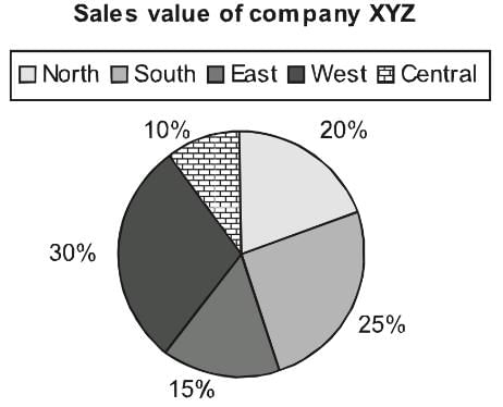
(a) Degree Approach: The central angle in a circle represents 360°, so any part or segment in a pie chart is calculated as a proportion of 360°.

Conversion of degree approach to percentage approach:
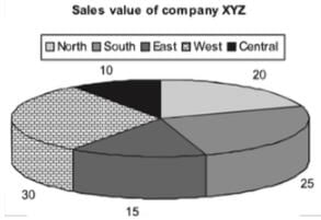
If we convert the same pie chart into the degree format, we will be required to do the following conversions:
Total = 100%
Hence, 1% = 3.6°
Central = 10% = 36°
North = 20% = 72°
South = 25% = 90°
East = 15% = 54°
West =30% = 108°
There are two types of pie charts
(a) Normal Pie Chart
This displays the contribution of each component of the pie.
(b) Exploded Pie Chart
It is conventional to have multiple pie charts related to the same paragraph question to determine different aspects & drawing comparisons between the data.
- Once in CAT 2018 aspirants like you were posed with a multi-layered pie chart question like below; let’s solve the same pie chart to understand the concept better.
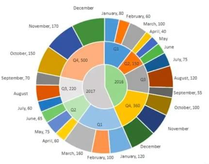
- The multi-layered pie-chart below shows the sales of LED television sets for a big retail electronics outlet during 2016 and 2017. The outer layer shows the monthly sales during this period, with each label showing the month followed by sales figure of that month.
- For some months, the sales figures are not given in the chart. The middle-layer shows quarter-wise aggregate sales figures (in some cases, aggregate quarter-wise sales numbers are not given next to the quarter). The innermost layer shows annual sales.
- It is known that the sales figures during the three months of the second quarter (April, May, June) of 2016 form an arithmetic progression, as do the three-monthly sales figures in the fourth quarter (October, November, December) of that year.
Q.1. What is the percentage increase in sales in December 2017 as compared to the sales in December 2016?
(a) 38.46
(b) 22.22
(c) 50.00
(d) 28.57
Q.2. In which quarter of 2017 was the percentage increase in sales from the same quarter of 2016 the highest?
(a) Q4
(b) Q1
(c) Q2
(d) Q3
Sol: To easily solve the questions we can first represent the information given in pie-chart in a consolidated table to make it easier to read and understand.
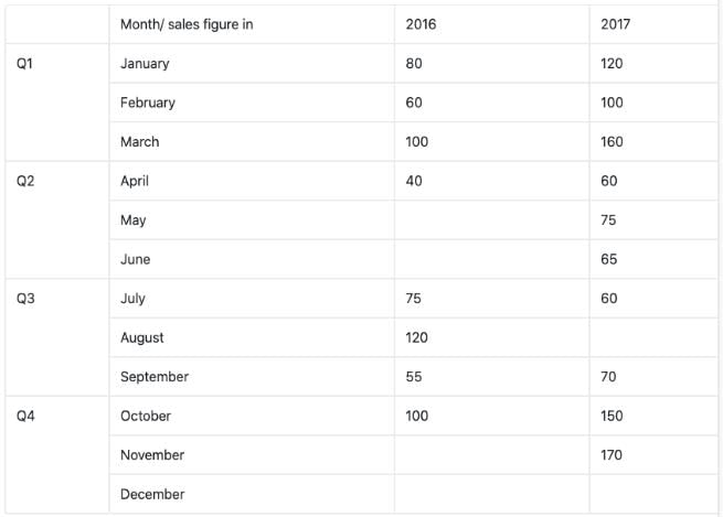
As you can see in the above table there a few month’s sales are missing and we need to evaluate them first from the given information and then find the answers to above given question.
Now, it’s been given in the question that the months of April, May, June in 2016 forms an A.P. and so does the months of Quarter 4 of 2016, i.e. Oct, Nov, Dec.
Total sale in Quarter 2 = 150
Let a-d, a, a+d be the three terms of A.P.
Hence, a-d + a + a+d =150
- 3a = 150
- a = 50
Since, April sale is 40, i.e. a-d = 40
- d = 10
Using that we can easily find the rest of the month sales values i.e. 50 and 60 respectively.
Similarly, using the above method we can find out the values for the month of Nov’16 and Dec’16. In this case, a would-be 120 and d = 20.
Thus, sales for these months are 120 and 140 respectively.
Now as you can see in the table, we have found out all missing monthly sales figure except for December’17 and August’17 which can be easily find out as
Total sales in Quarter 4 of 2017 = 500
And sales in Oct’17 and Nov’17 are 150 and 170 respectively.
Hence, the sale for December = 500 -150 - 170 = 180
And similarly, Sale for August’17 = 220 – 60 – 70 = 90
Therefore, our table becomes,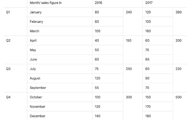 Now we are in position to answer all the given questions using the above table.
Ans 1: Percentage increase in sales of Dec’17 as compared to Dec’16 =
Ans 2: We need to evaluate the quarter with the highest increase in sales in percentage terms.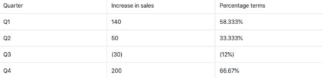
Significance of Pie Charts
The pie chart has gained prominence due to the following reasons:
- In a pie chart, we get a clear picture of the contribution of different sectors to the build up of the total. E.g., presentation of budgets.
- Comparing two pie charts is easier than comparing two bar charts or any other format of data representation.
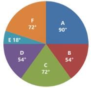
Following is the cost analysis of a book “Guide to Digital Marketing”.
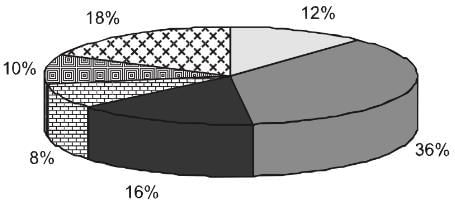 What is the central angle showing the cost of paper?
(a) 42.8°
(b) 32.6°
(c) 36.8°
(d) 57.6°
Sol: Percentage of paper cost in total cost - 16%
We know that the sum of angles in pie chart is 100°
Hence, Required Angle = (16/100 × 360) = 57.6°
Practice Question
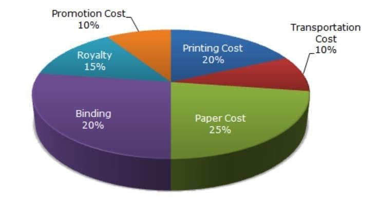
If 5500 copies are published and the transportation cost on them amounts to Rs. 82,500, then what should be the selling price of the Book so that the publisher can earn a profit of 25%?
|
205 videos|264 docs|136 tests
|
FAQs on Pie Charts - CSAT Preparation - UPSC
| 1. What are the two types of pie charts? |  |
| 2. How are pie charts significant? | |
| 3. How can pie charts be used in data analysis? | |
| 4. How can pie charts be created and interpreted? | |
| 5. What are some limitations of using pie charts? | |


Semester Notes
,Pie Charts | CSAT Preparation - UPSC
,video lectures
,Viva Questions
,Exam
,Pie Charts | CSAT Preparation - UPSC
,practice quizzes
,Important questions
,Objective type Questions
,mock tests for examination
,shortcuts and tricks
,study material
,ppt
,Summary
,Pie Charts | CSAT Preparation - UPSC
,past year papers
,Free
,Extra Questions
,Sample Paper
,MCQs
,Previous Year Questions with Solutions
;


Pie Charts Free PDF Download
Importance of Pie Charts
Pie Charts Notes
Pie Charts UPSC Questions
Study Pie Charts on the App
|
© EduRev
|
Education Revolution
|


|


