HTML Layout & HTML Responsive | HTML for Junior Classes - Class 3 PDF Download
Websites often display content in multiple columns (like a magazine or a newspaper).
Example

HTML Layout Elements
HTML has several semantic elements that define the different parts of a web page:
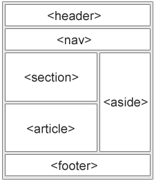
- <header> - Defines a header for a document or a section
- <nav> - Defines a set of navigation links
- <section> - Defines a section in a document
- <article> - Defines an independent, self-contained content
- <aside> - Defines content aside from the content (like a sidebar)
- <footer> - Defines a footer for a document or a section
- <details> - Defines additional details that the user can open and close on demand
- <summary> - Defines a heading for the <details> element
HTML Layout Techniques
There are four different techniques to create multicolumn layouts. Each technique has its pros and cons:
- CSS framework
- CSS float property
- CSS flexbox
- CSS grid
CSS Frameworks
If you want to create your layout fast, you can use a CSS framework, like W3.CSS or Bootstrap.
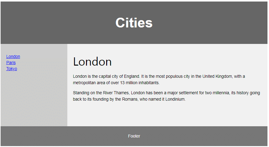
CSS Float Layout
It is common to do entire web layouts using the CSS float property. Float is easy to learn - you just need to remember how the float and clear properties work. Disadvantages: Floating elements are tied to the document flow, which may harm the flexibility. Learn more about float in our CSS Float and Clear chapter.
Example
 CSS Flexbox Layout
Use of flexbox ensures that elements behave predictably when the page layout must accommodate different screen sizes and different display devices.
Example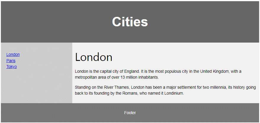
CSS Grid Layout
The CSS Grid Layout Module offers a grid-based layout system, with rows and columns, making it easier to design web pages without having to use floats and positioning.
HTML Responsive Web Design
Responsive web design is about creating web pages that look good on all devices!
A responsive web design will automatically adjust for different screen sizes and viewports.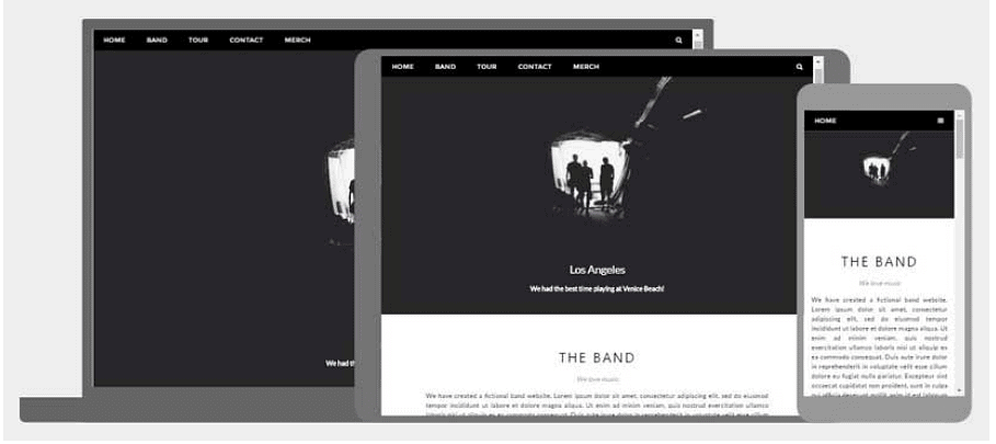
What is Responsive Web Design?
Responsive Web Design is about using HTML and CSS to automatically resize, hide, shrink, or enlarge, a website, to make it look good on all devices (desktops, tablets, and phones):
Setting The Viewport
To create a responsive website, add the following <meta> tag to all your web pages:
Example
<meta name="viewport" content="width=device-width, initial-scale=1.0">
This will set the viewport of your page, which will give the browser instructions on how to control the page's dimensions and scaling.
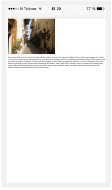
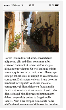
Here is an example of a web page without the viewport meta tag, and the same web page with the viewport meta tag:
Without the viewport meta tag:
With the viewport meta tag:
Tip: If you are browsing this page on a phone or a tablet, you can click on the two links above to see the difference.
Responsive Images
Responsive images are images that scale nicely to fit any browser size.
Using the width Property
If the CSS width property is set to 100%, the image will be responsive and scale up and down:

Example
<img src="https://cn.edurev.in/mg_girl.jpg" style="width:100%;">
Notice that in the example above, the image can be scaled up to be larger than its original size. A better solution, in many cases, will be to use the max-width property instead.
Using the max-width Property
If the max-width property is set to 100%, the image will scale down if it has to, but never scale up to be larger than its original size:
Example
<img src="https://cn.edurev.in/mg_girl.jpg" style="max-width:100%;height:auto;">
Show Different Images Depending on Browser Width
The HTML <picture> element allows you to define different images for different browser window sizes.
Resize the browser window to see how the image below change depending on the width:

Example
<picture>
<source srcset="img_smallflower.jpg" media="(max-width: 600px)">
<source srcset="img_flowers.jpg" media="(max-width: 1500px)">
<source srcset="flowers.jpg">
<img src="https://cn.edurev.in/mg_smallflower.jpg" alt="Flowers">
</picture>
Responsive Text Size
The text size can be set with a "vw" unit, which means the "viewport width".
That way the text size will follow the size of the browser window:

Example
<h1 style="font-size:10vw">Hello World</h1>
Media Queries
In addition to resize text and images, it is also common to use media queries in responsive web pages.
With media queries you can define completely different styles for different browser sizes.
Example: resize the browser window to see that the three div elements below will display horizontally on large screens and stacked vertically on small screens:
Example
<style>
.left, .right {
float: left;
width: 20%; /* The width is 20%, by default */
}
.main {
float: left;
width: 60%; /* The width is 60%, by default */
}
/* Use a media query to add a breakpoint at 800px: */
@media screen and (max-width: 800px) {
.left, .main, .right {
width: 100%; /* The width is 100%, when the viewport is 800px or smaller */
}
}
</style>
Responsive Web Page - Full Example
A responsive web page should look good on large desktop screens and on small mobile phones.
Responsive Web Design - Frameworks
All popular CSS Frameworks offer responsive design.
They are free, and easy to use.
W3.CSS
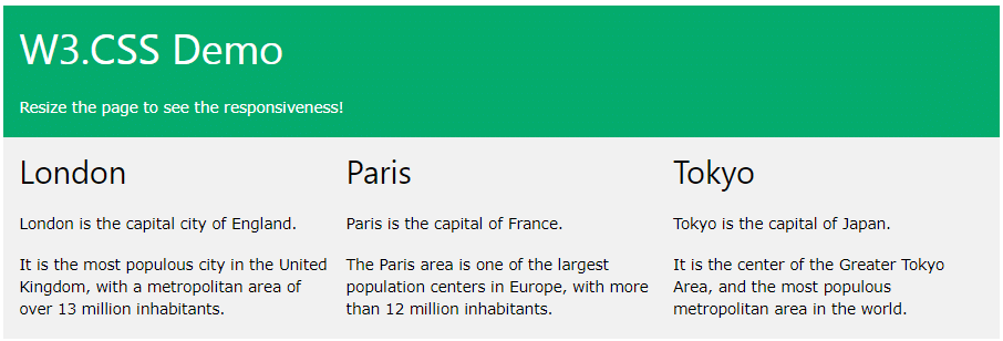
- W3.CSS is a modern CSS framework with support for desktop, tablet, and mobile design by default.
- W3.CSS is smaller and faster than similar CSS frameworks.
- W3.CSS is designed to be a high quality alternative to Bootstrap.
- W3.CSS is designed to be independent of jQuery or any other JavaScript library.
Example
<!DOCTYPE html>
<html>
<meta name="viewport" content="width=device-width, initial-scale=1">
<link rel="stylesheet" href="https://www.w3schools.com/w3css/4/w3.css">
<body>
<div class="w3-container w3-green">
<h1>W3Schools Demo</h1>
<p>Resize this responsive page!</p>
</div>
<div class="w3-row-padding">
<div class="w3-third">
<h2>London</h2>
<p>London is the capital city of England.</p>
<p>It is the most populous city in the United Kingdom,
with a metropolitan area of over 13 million inhabitants.</p>
</div>
<div class="w3-third">
<h2>Paris</h2>
<p>Paris is the capital of France.</p>
<p>The Paris area is one of the largest population centers in Europe,
with more than 12 million inhabitants.</p>
</div>
<div class="w3-third">
<h2>Tokyo</h2>
<p>Tokyo is the capital of Japan.</p>
<p>It is the center of the Greater Tokyo Area,
and the most populous metropolitan area in the world.</p>
</div>
</div>
</body>
</html>
Bootstrap
Example
<!DOCTYPE html>
<html lang="en">
<head>
<title>Bootstrap Example</title>
<meta charset="utf-8">
<meta name="viewport" content="width=device-width, initial-scale=1">
<link rel="stylesheet" href="https://maxcdn.bootstrapcdn.com/bootstrap/3.4.1/css/bootstrap.min.css">
<script src="https://ajax.googleapis.com/ajax/libs/jquery/3.5.1/jquery.min.js"></script>
<script src="https://maxcdn.bootstrapcdn.com/bootstrap/3.4.1/js/bootstrap.min.js"></script>
</head>
<body>
<div class="container">
<div class="jumbotron">
<h1>My First Bootstrap Page</h1>
</div>
<div class="row">
<div class="col-sm-4">
...
</div>
<div class="col-sm-4">
...
</div>
<div class="col-sm-4">
...
</div>
</div>
</div>
</body>
</html>
|
14 videos|31 docs|24 tests
|


